wexner center symbol system
autumn 2023
For this project, I was assigned the Wexner Center of the Arts as a client so that I could create a set of symbols that showcased their values and brand well. We began in black and white, then moving to color. I chose a very geometric and angular style to give the symbol set movement and rhythm as well as fit into the creative energy of the space itself.
Below are detail images of each symbol, and after that, patterns using the symbols and a poster.
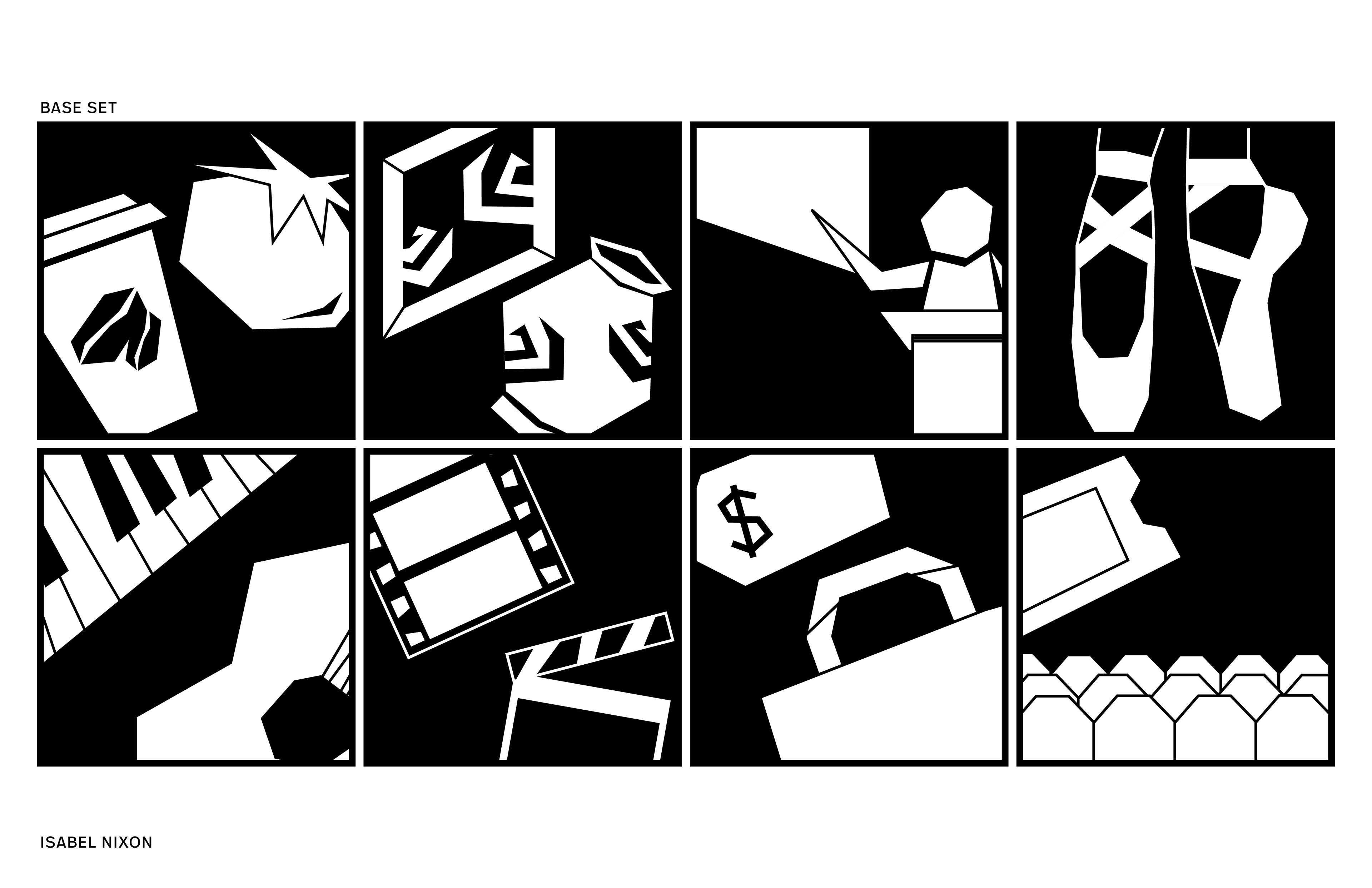
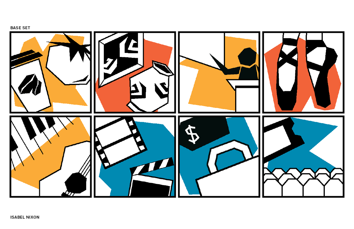
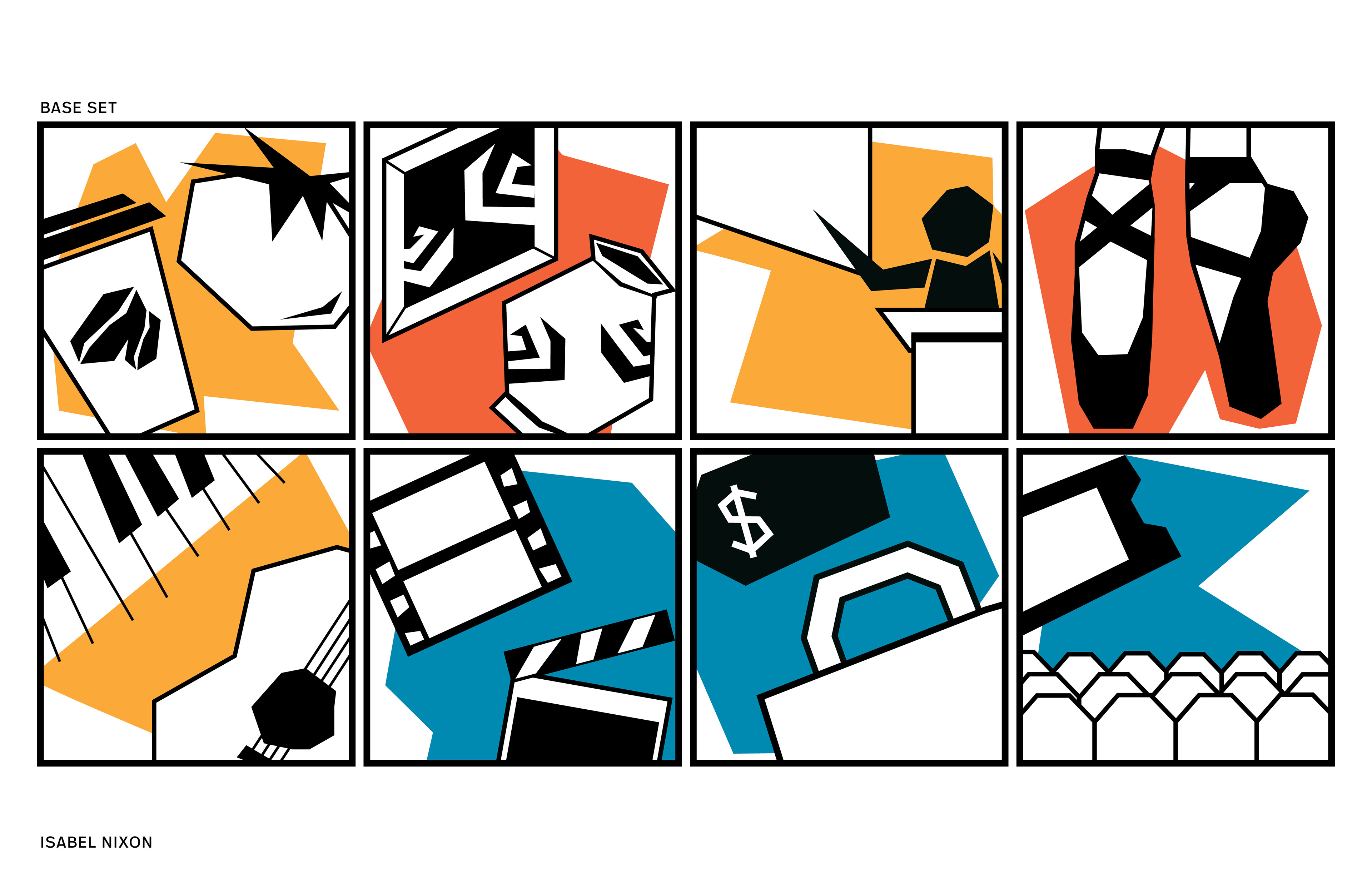
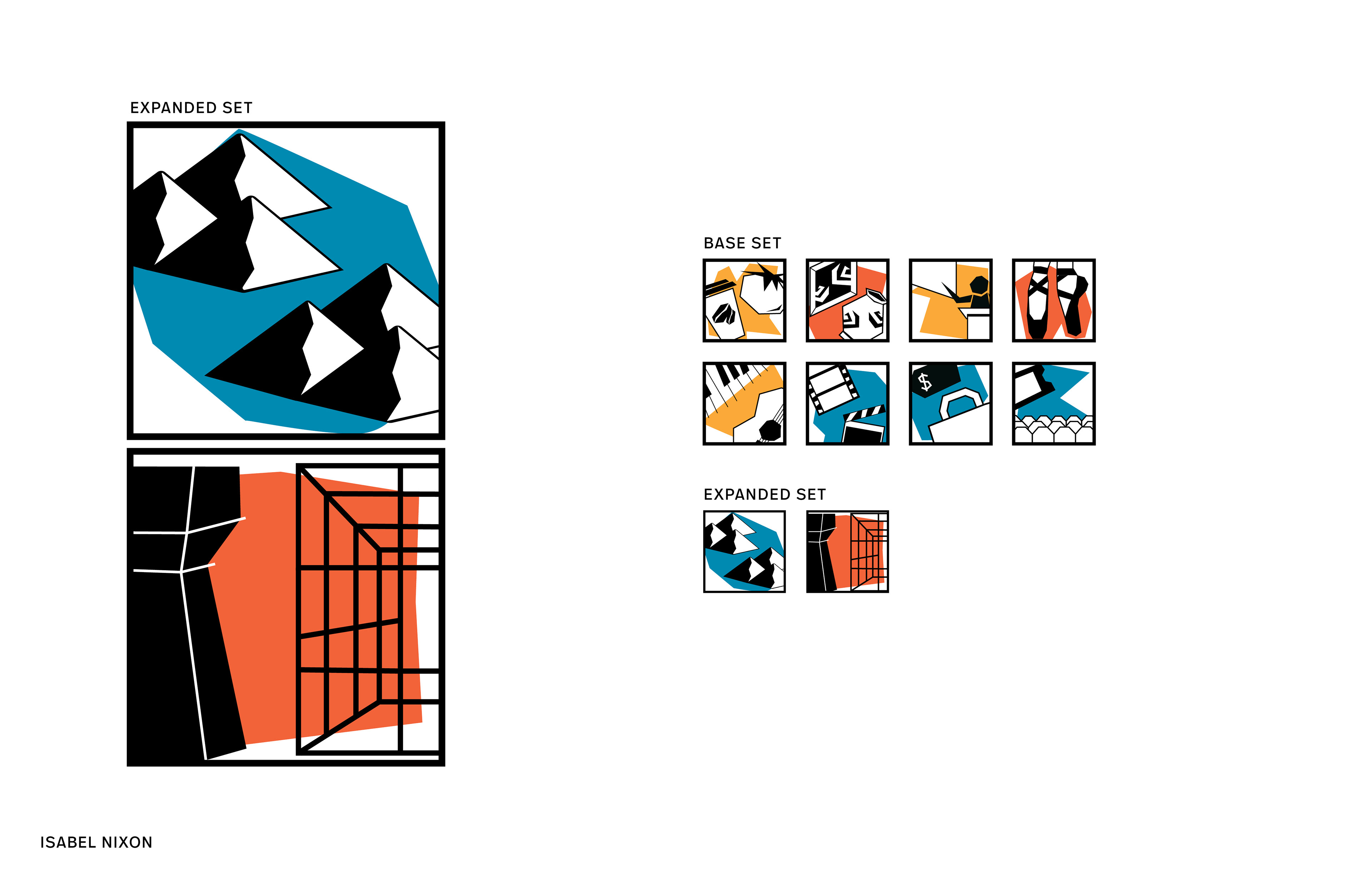
We began making symbols for ten different categories in black and white, making sure they were visible at both a larger size (5 inches) and a smaller size (1 inch). I used a geometric and irregular style to guide my symbol system because it matched the rhythm that flows through The Wex in its many different arts-related programs.
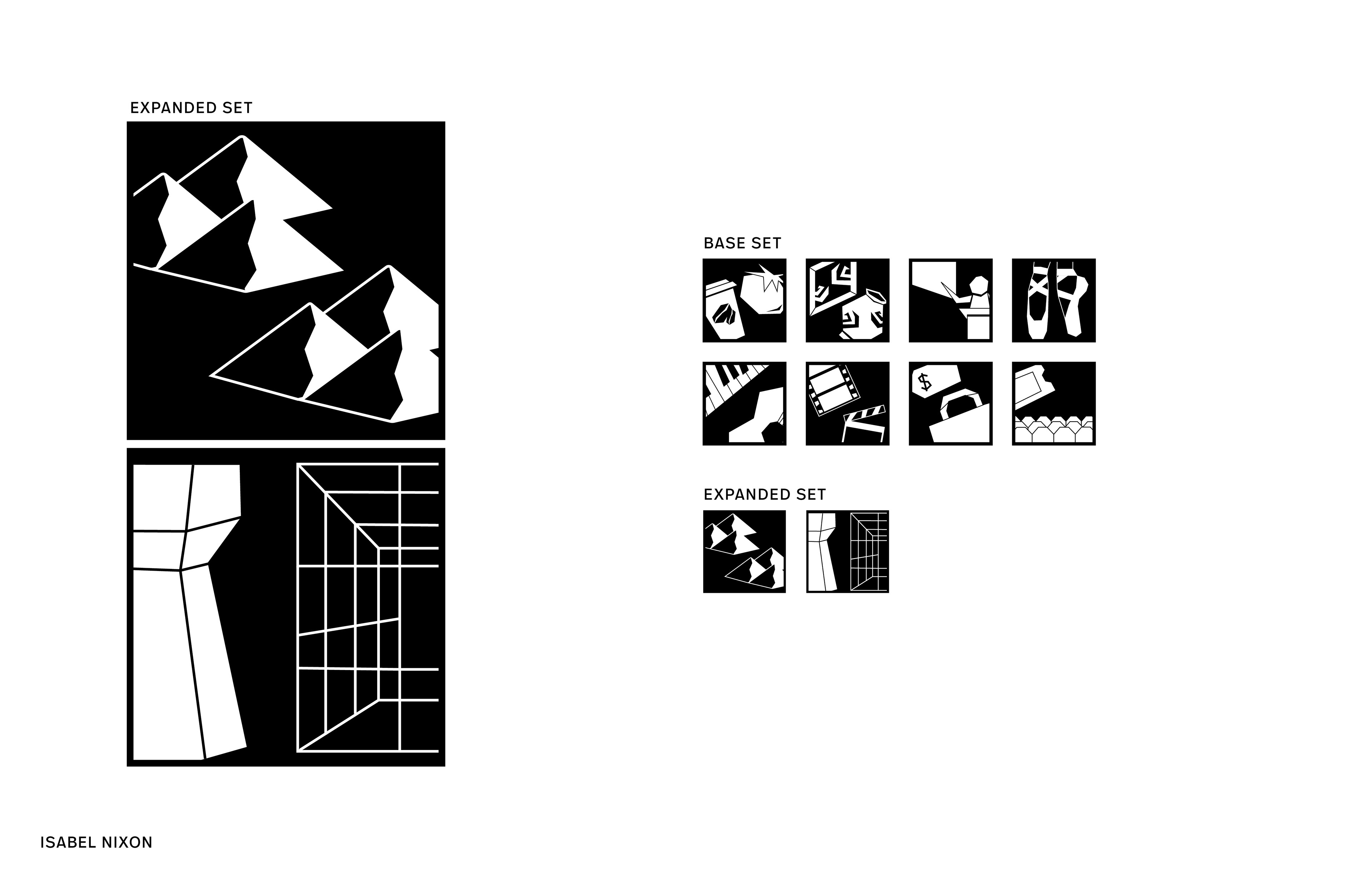
Next, we incorporated color into our symbols. I focused on a brighter, more dynamic color palette to match the versatility and diversity values of The Wex. I gave each symbol a uniquely shaped background to differentiate it from the rest and give the icons more movement.
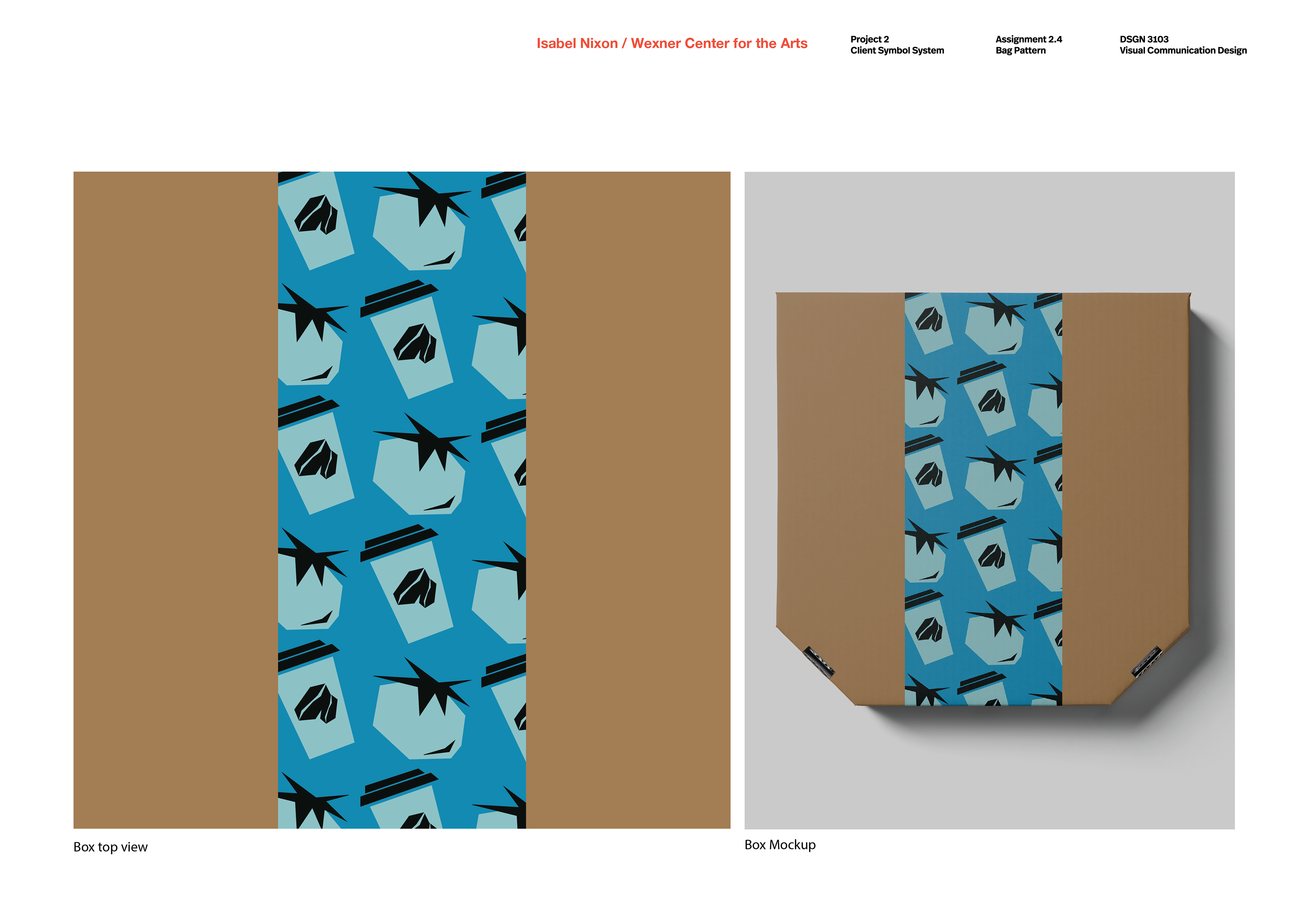
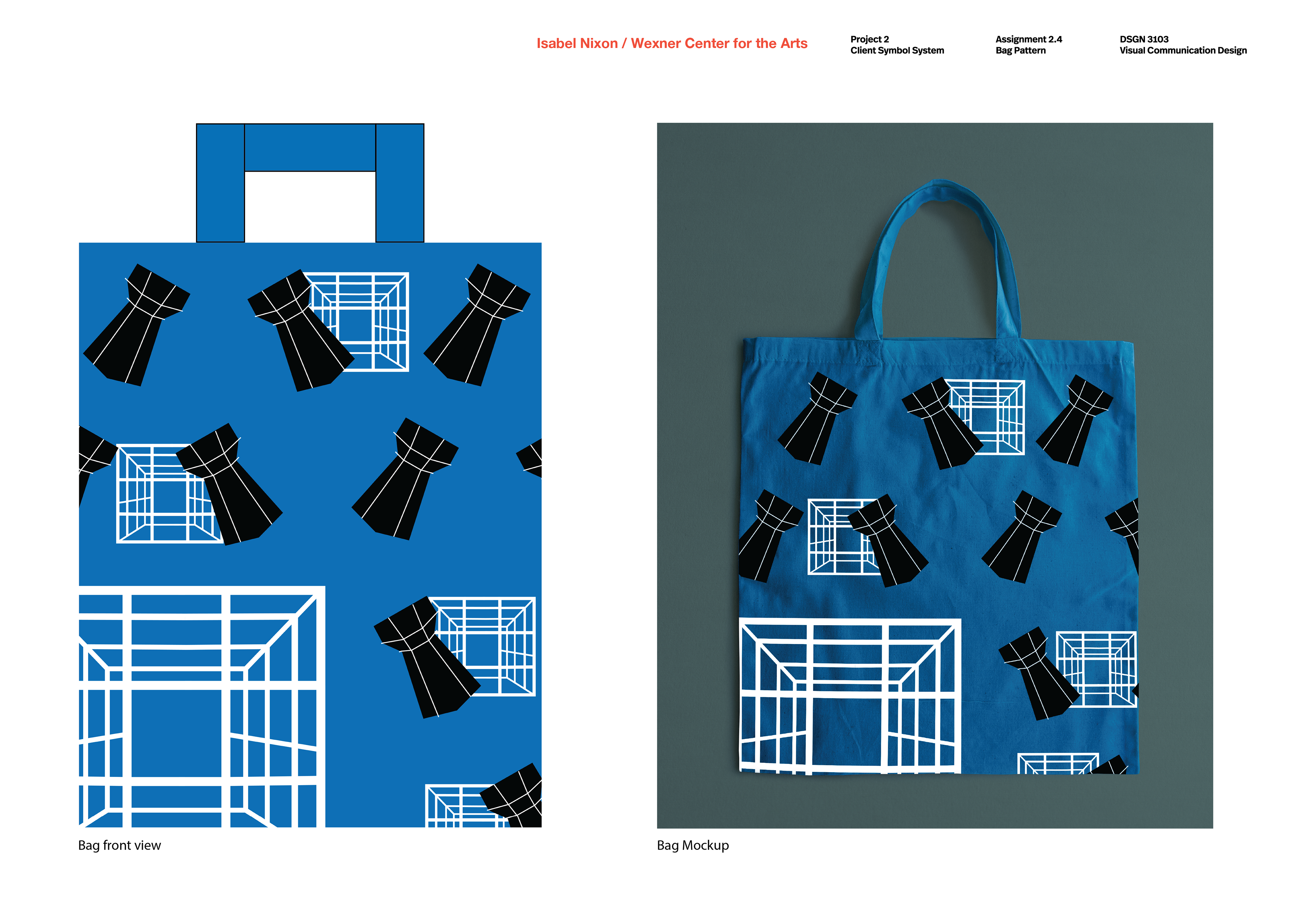
After finalizing our symbol systems in both B&W and color, we worked on creating patterns that could be applied to various pieces of merchandise for The Wex. I chose a to-go box for the Heirloom Cafe and used the two objects in my symbol for the cafe in the pattern, and then I created a tote bag pattern using the architecture tour stops objects because they are some of the most recognizable shapes of The Wex and would represent the brand well.
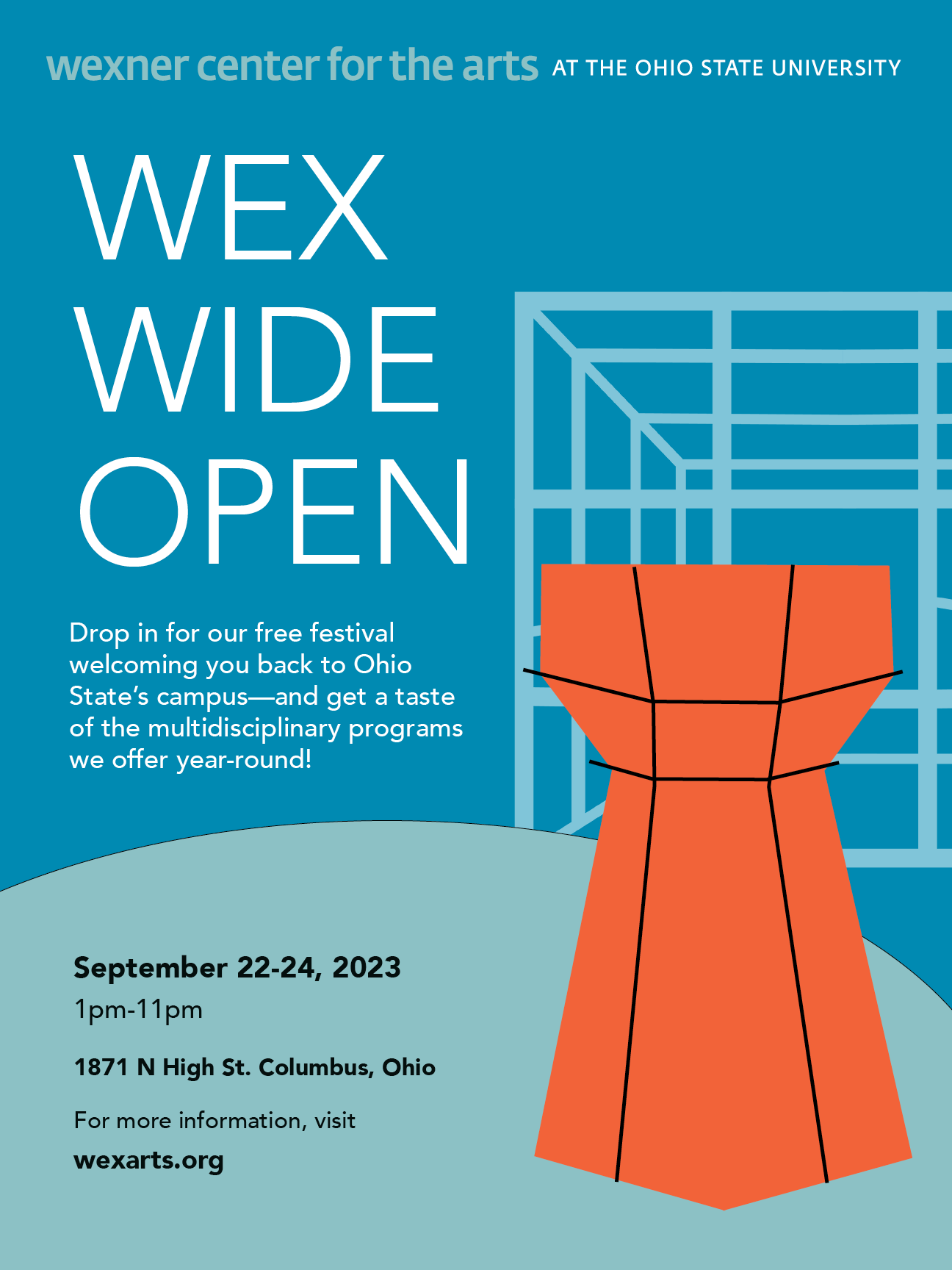
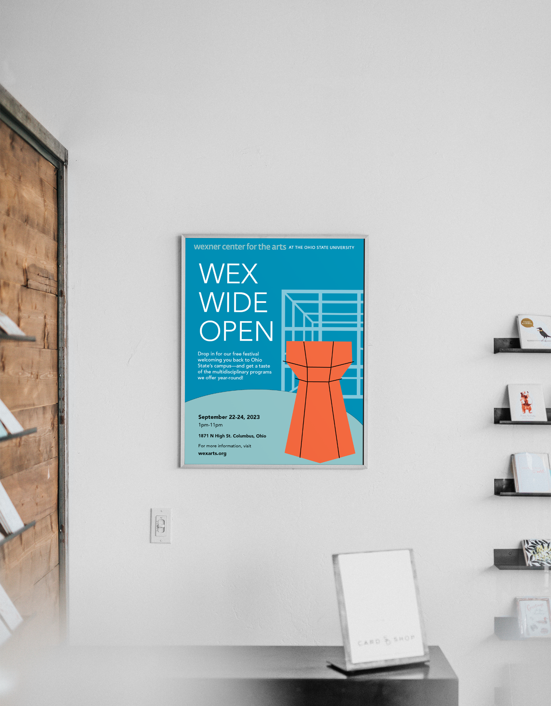
After creating patterns from our symbols, we were to use the symbols on a poster that expanded on the brand's values and identity we chose. I also created this mockup emulating what the poster would look like hung in The Wex Store (not my photo).
Below is the process book for this project and my five senses symbol set.