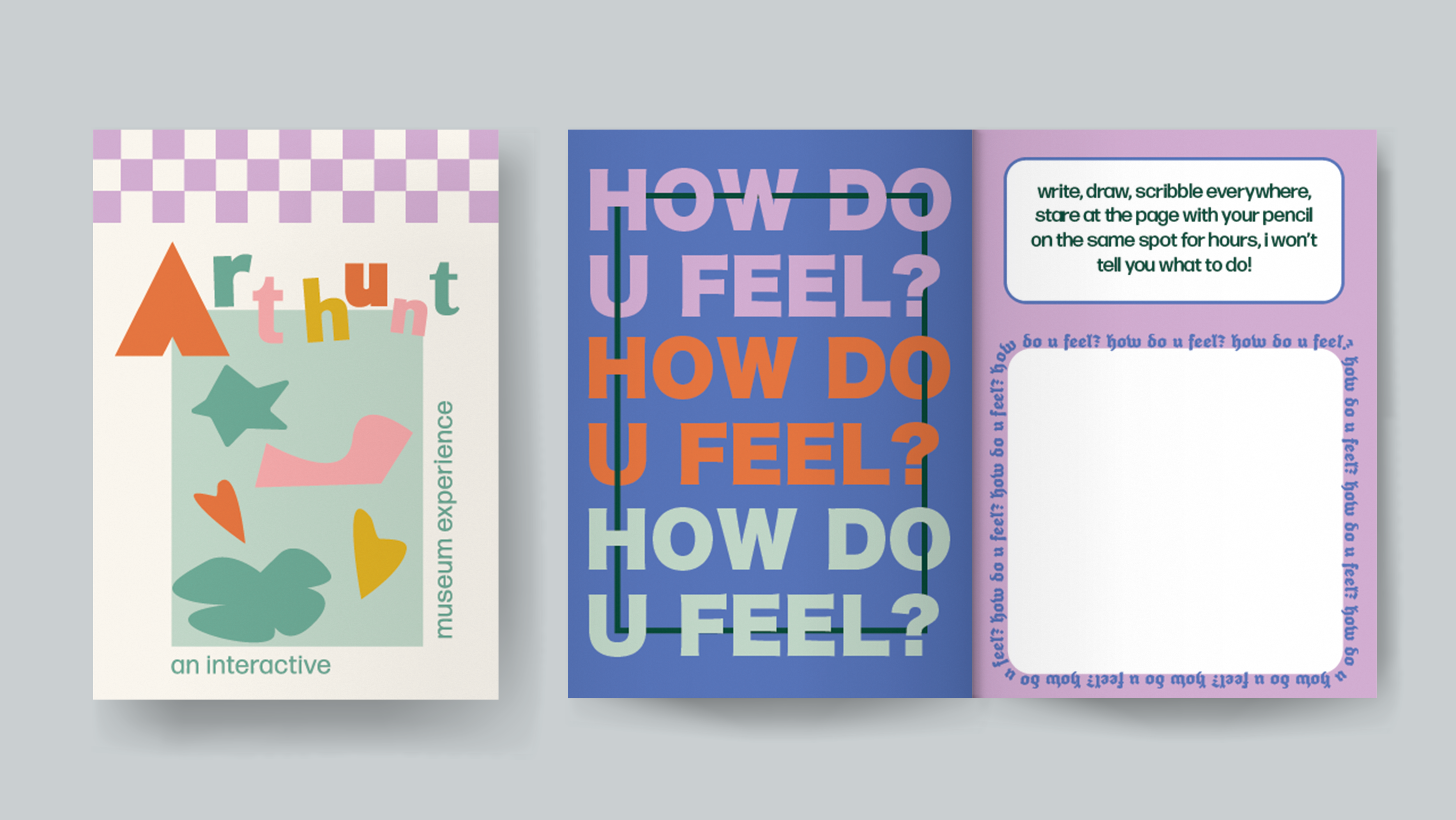
visualizing self-care data
spring 2025
For ten days, I recorded three tasks I completed for self care, as well as how much water I drank, three things I was grateful for, and my mood overall. I was tasked with creating a visual that best represented the narrative being presented through my data.

I began by entering the data into a spreadsheet and organizing it according to different parameters. I entered my data at the end of each day, looking back on what I did and how I felt overall.
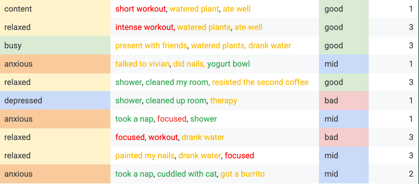
Original dataset.
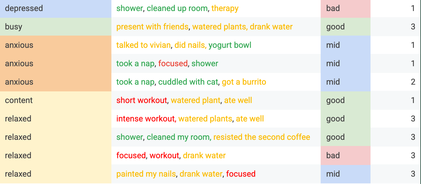
Data organized by mood.
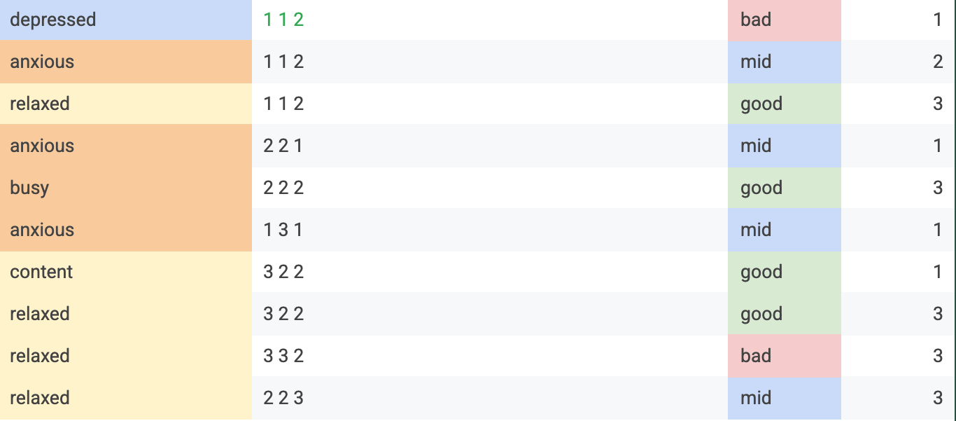
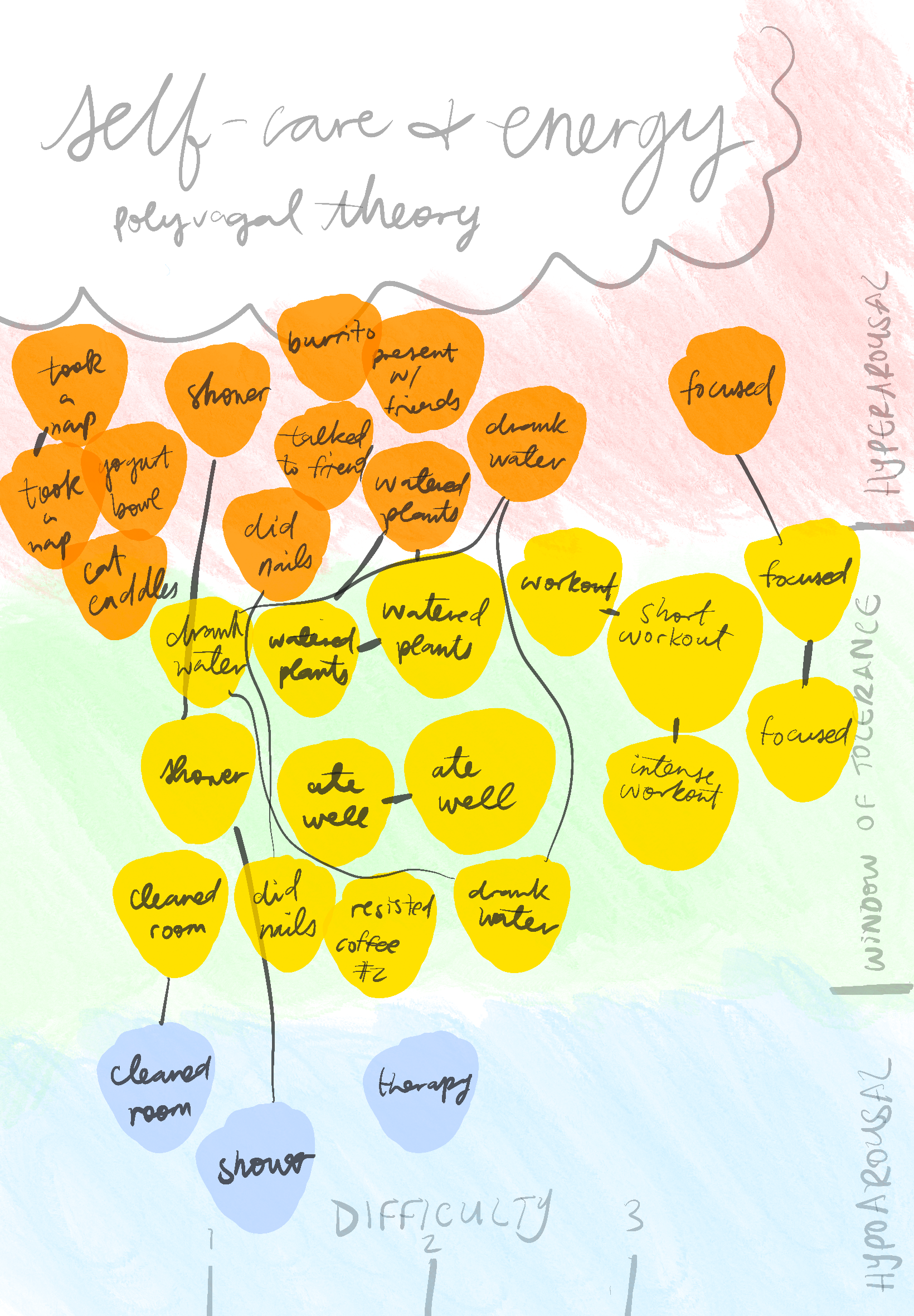
Data with self care tasks ranked by difficulty.
I noticed a pattern when relating the difficulty of self care tasks and my overall mood that day. The difficulty rating is as follows: 1 for tasks I enjoy completing and are easy to start (napping), 2 for tasks that require more effort but aren't strenuous (watering plants), and 3 for strenuous activities of higher effort (working out).
I recalled a chart of moods relating energy levels and pleasantness, and found that there was some correlation between energy levels associated with my moods rather than pleasantness.


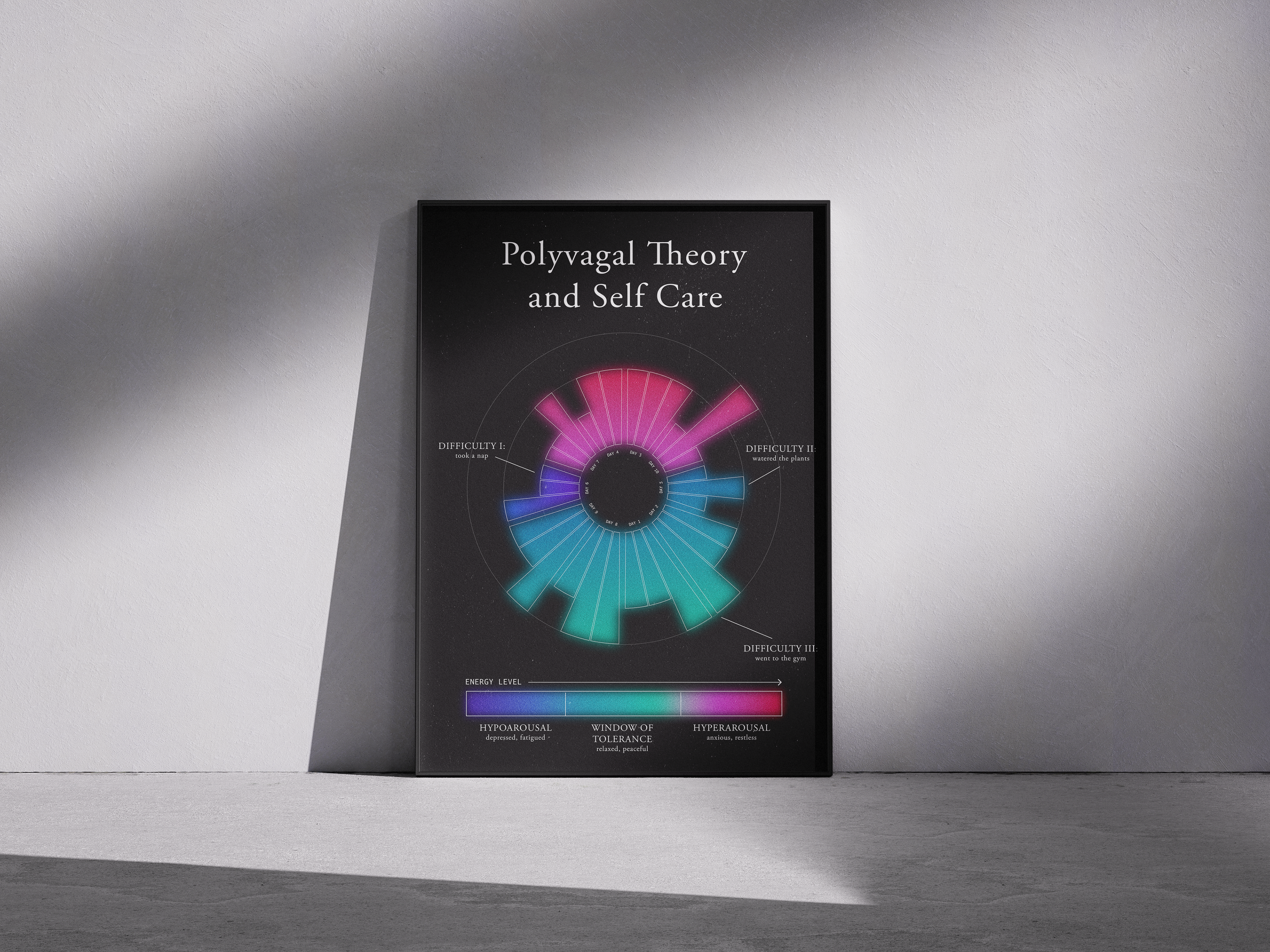
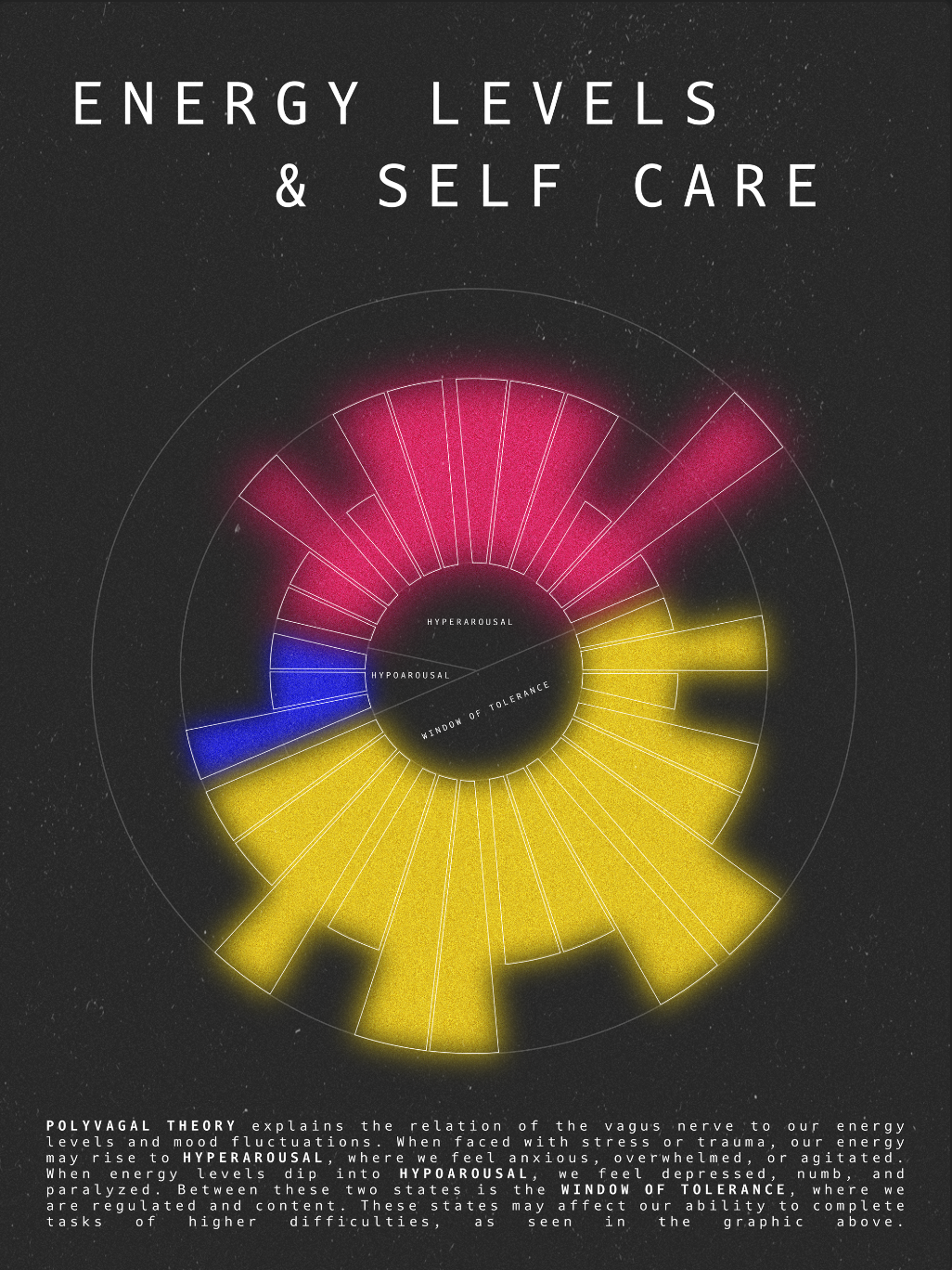
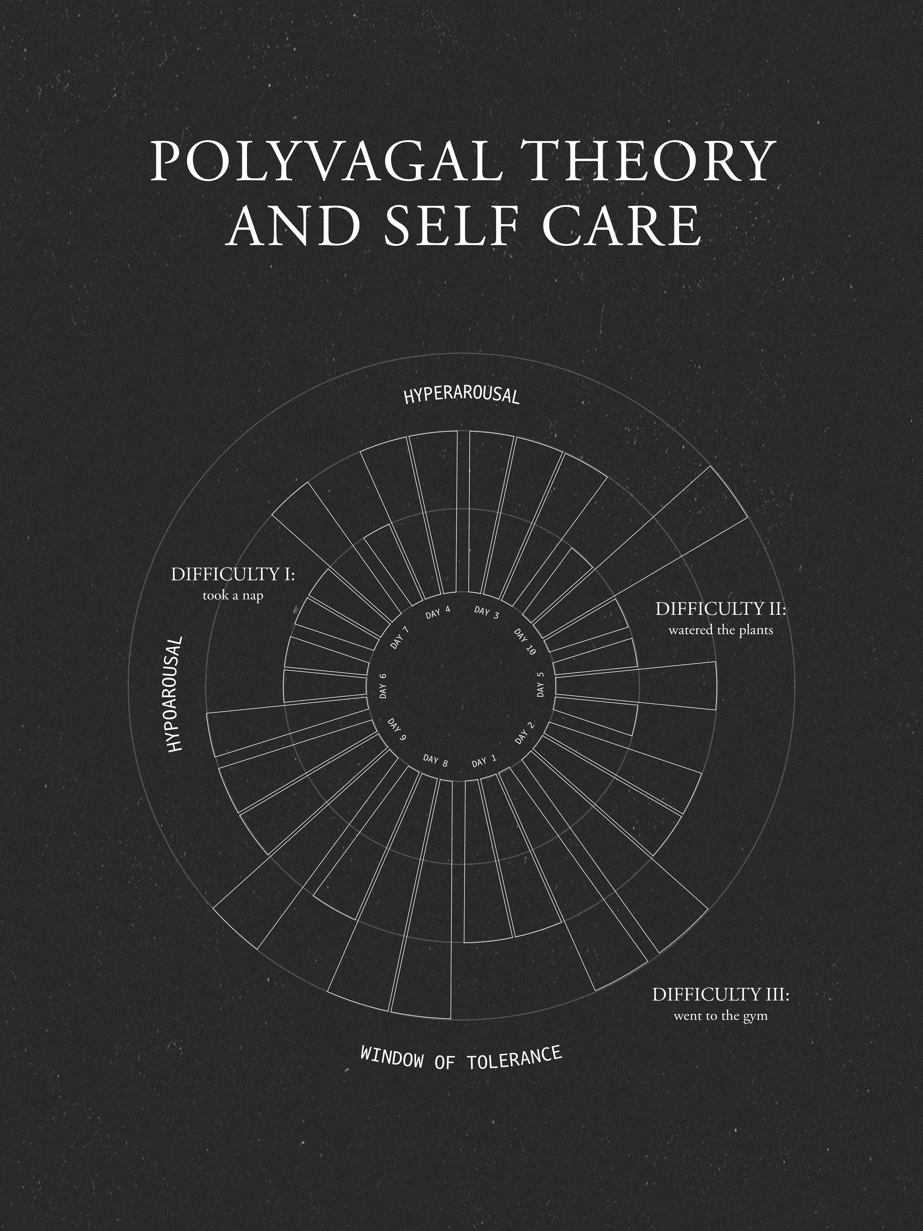
Another mood-related theory I remembered when making this graphic was polyvagal theory, which describes the relationship of the body's vagus nerve to energy levels and fight/flight/freeze coping mechanisms.

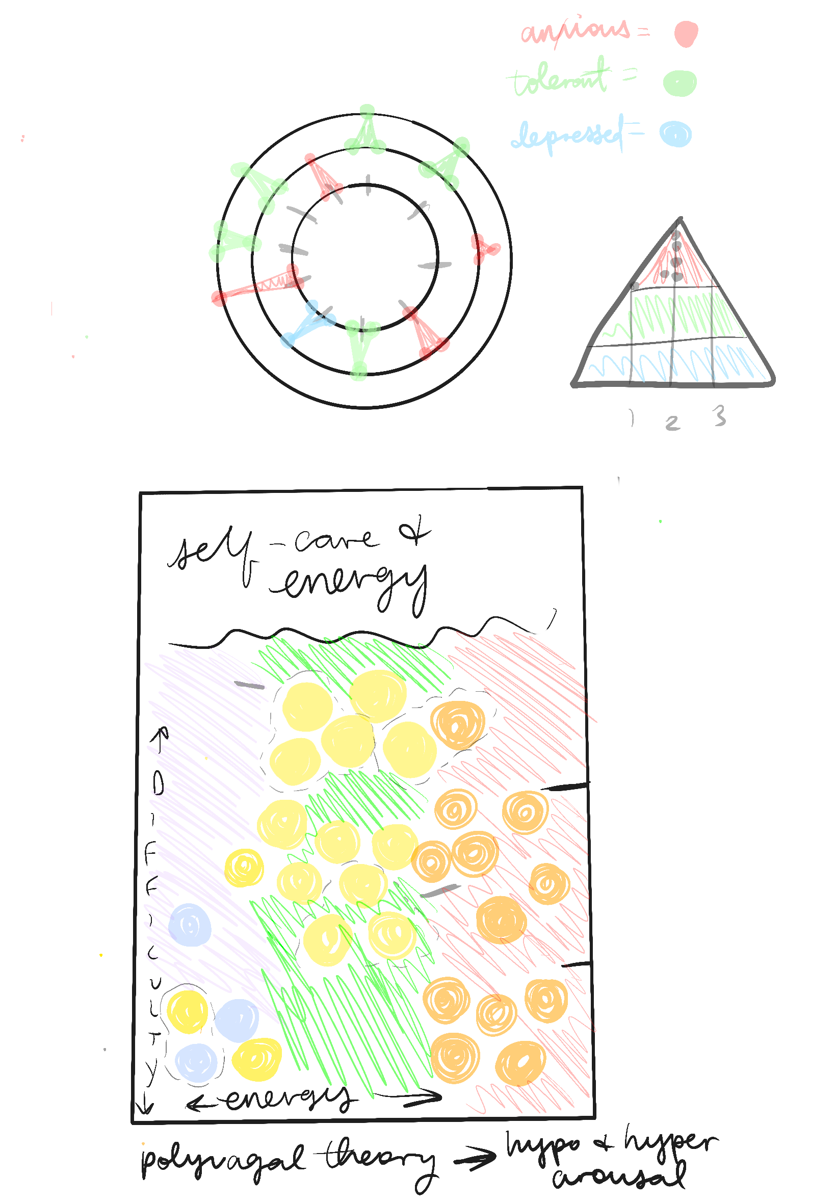

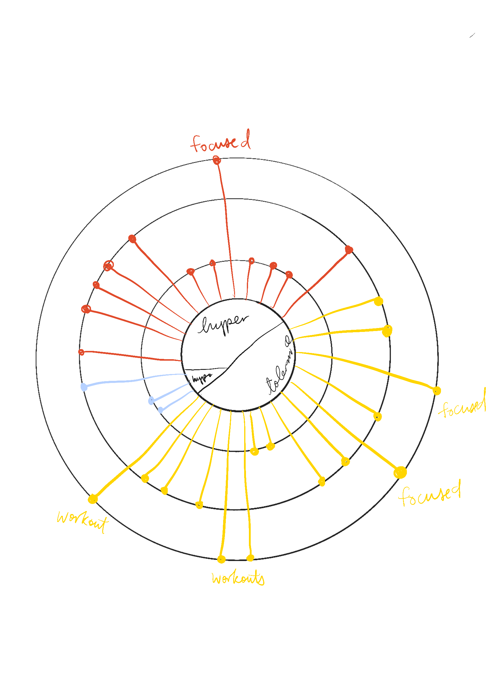
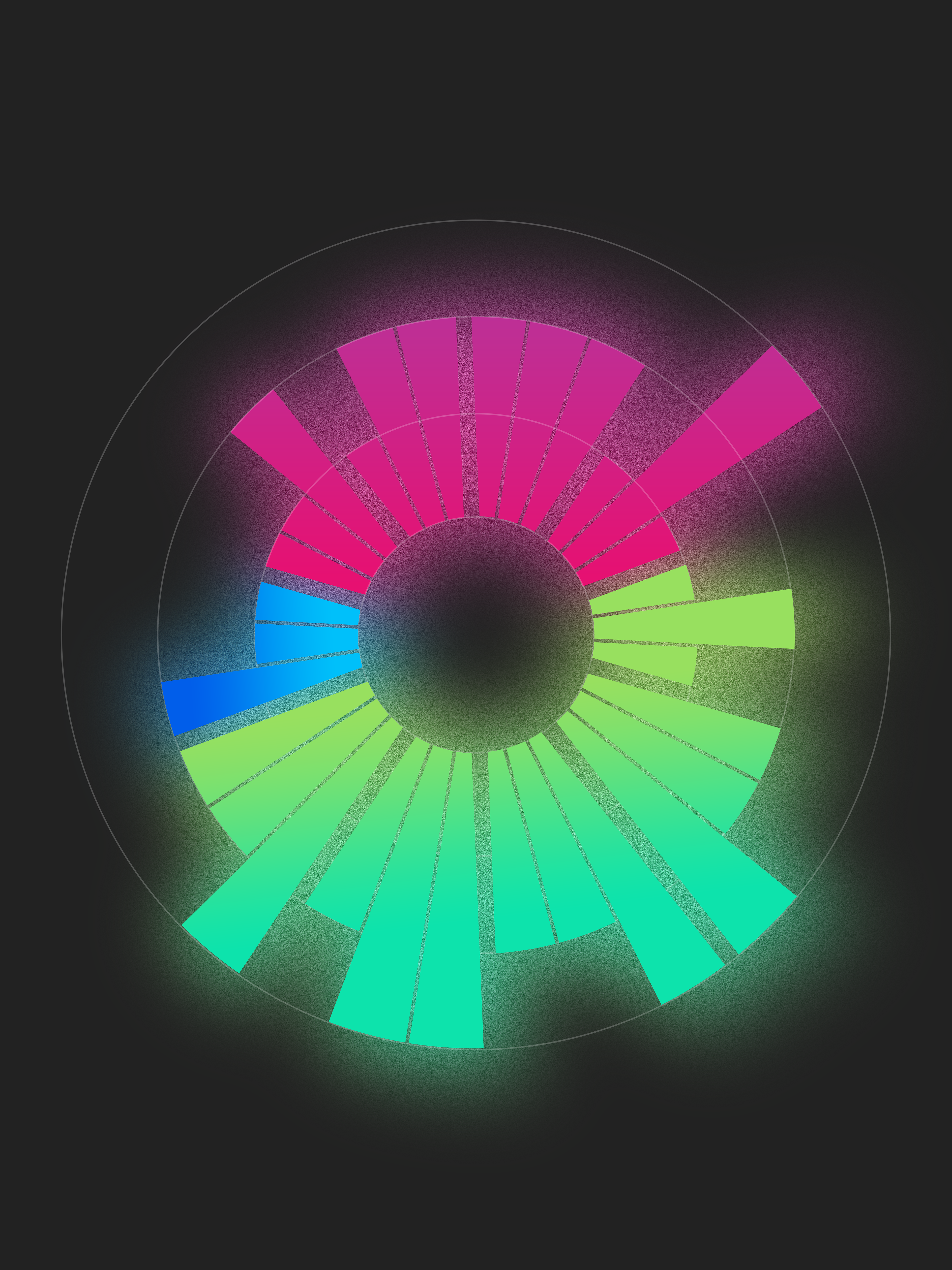
When I sketched visualizations of this theory, there was a strong pull toward higher difficulty tasks when I encountered a mood within the "window of tolerance", which is where the body feels safe, with just the right amount of energy. This narrative emerged to me when I made a sunburst diagram, so this was the final model I used.
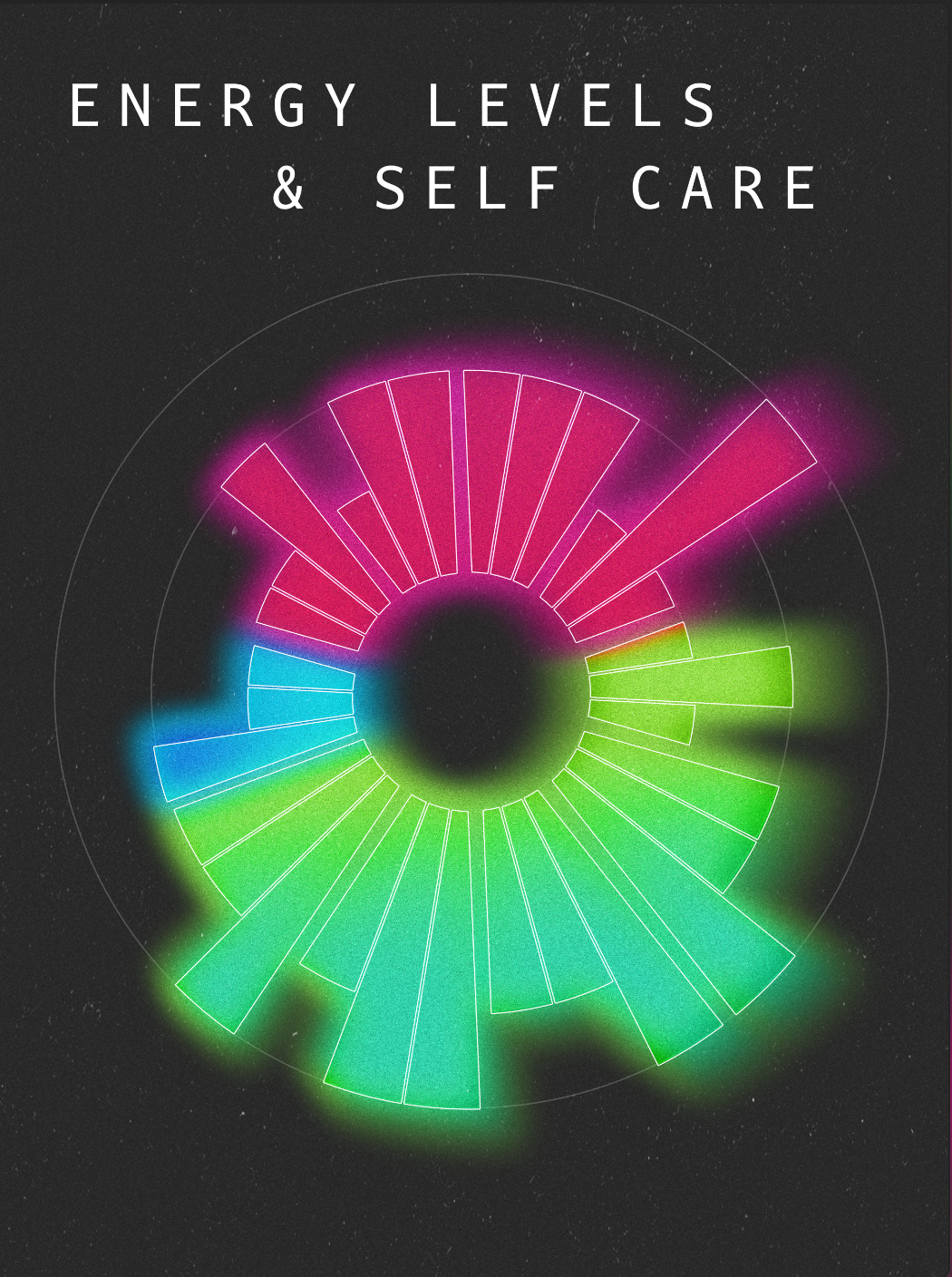
I refined the shapes, effects, and colors I wanted to use, eliminating excess information. I took a while deciding the color palette since the topic is so psychological and I wanted to use colors with subtle emotional connotations.
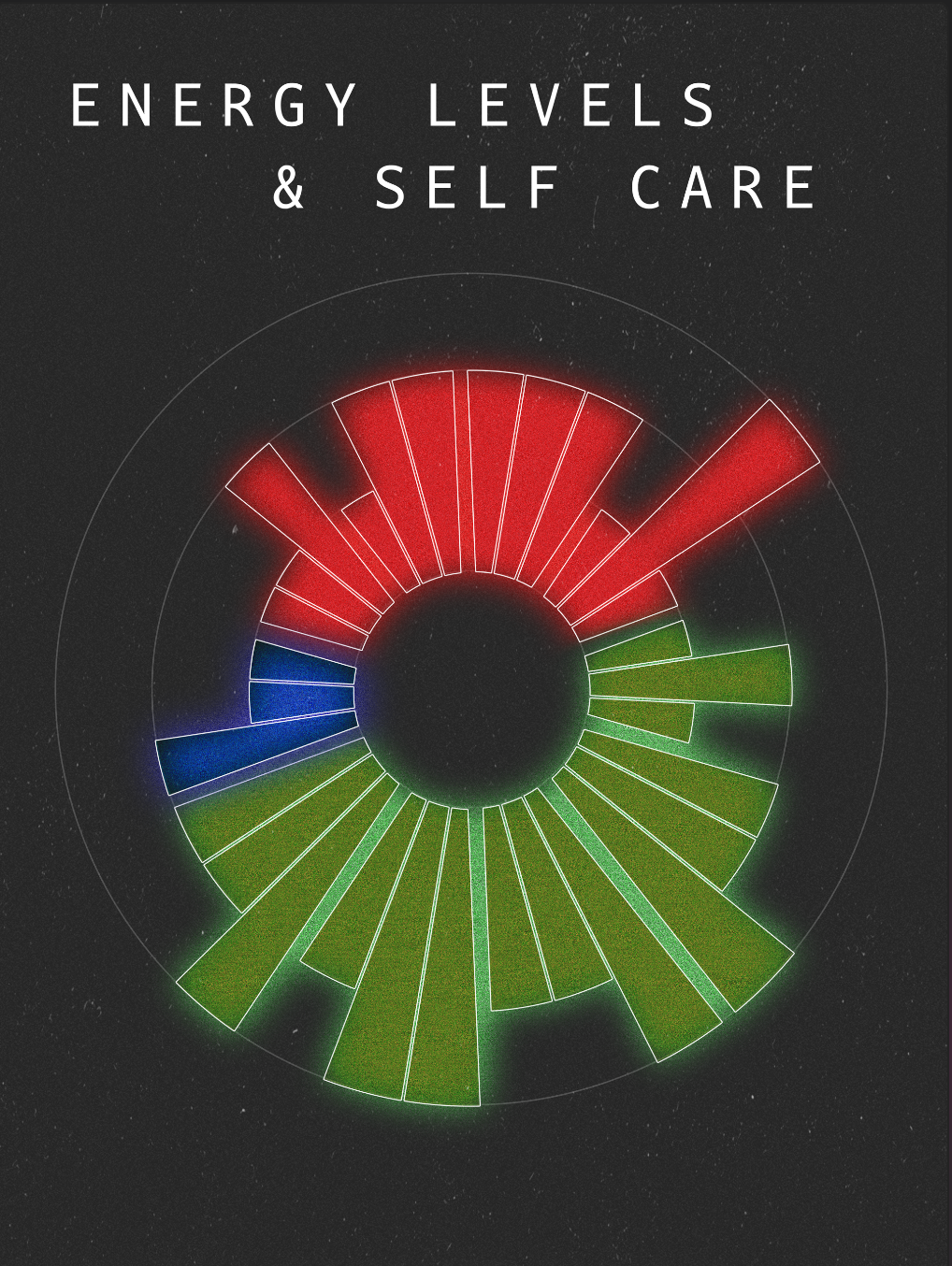
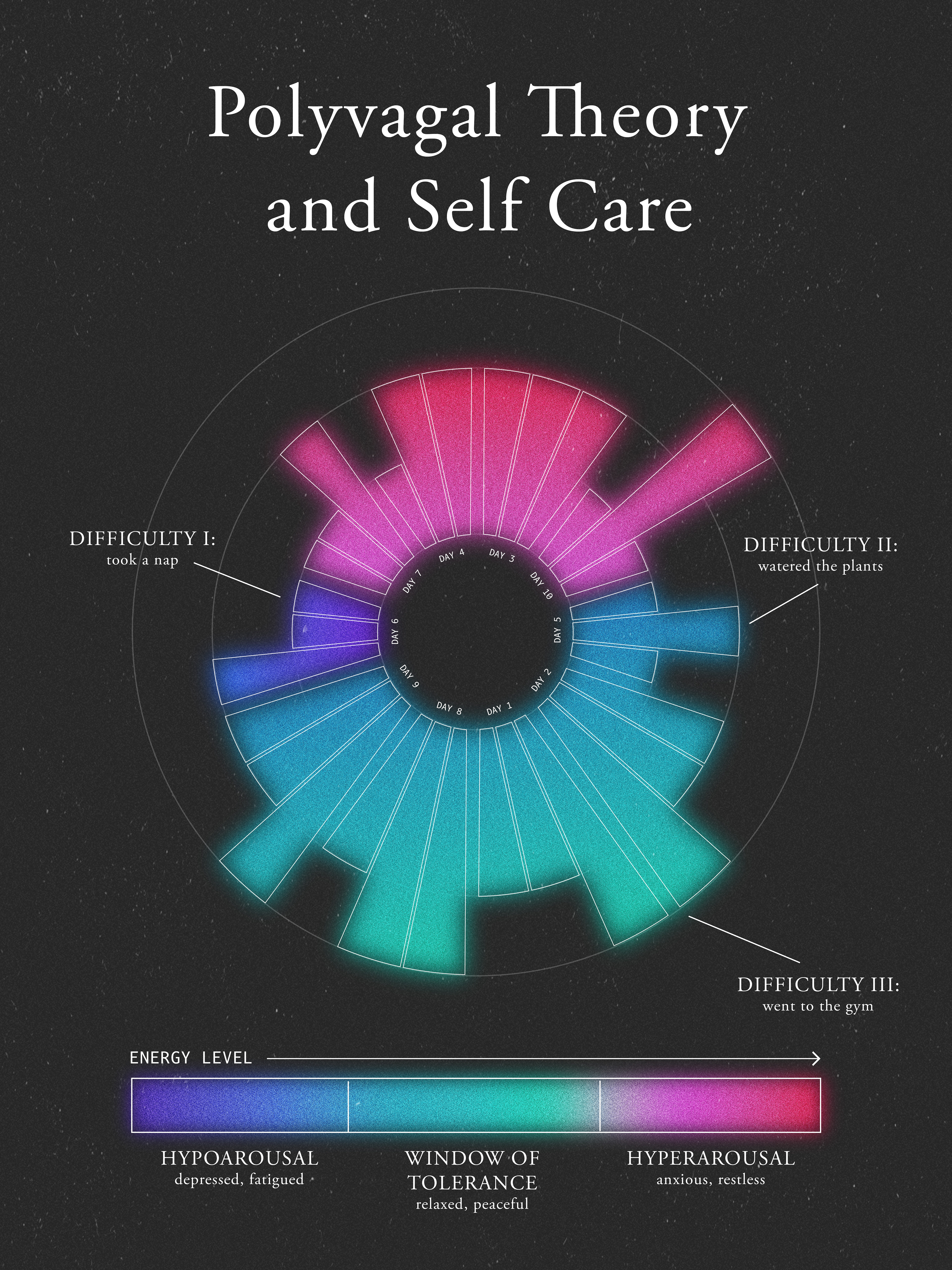
After meeting with my professor, I realized the difficulty levels weren't being portrayed clearly, so I specified what each circle was signifying and created a better system explaining polyvagal theory that didn't require a huge paragraph.
This draft focused on labeling and clarity.
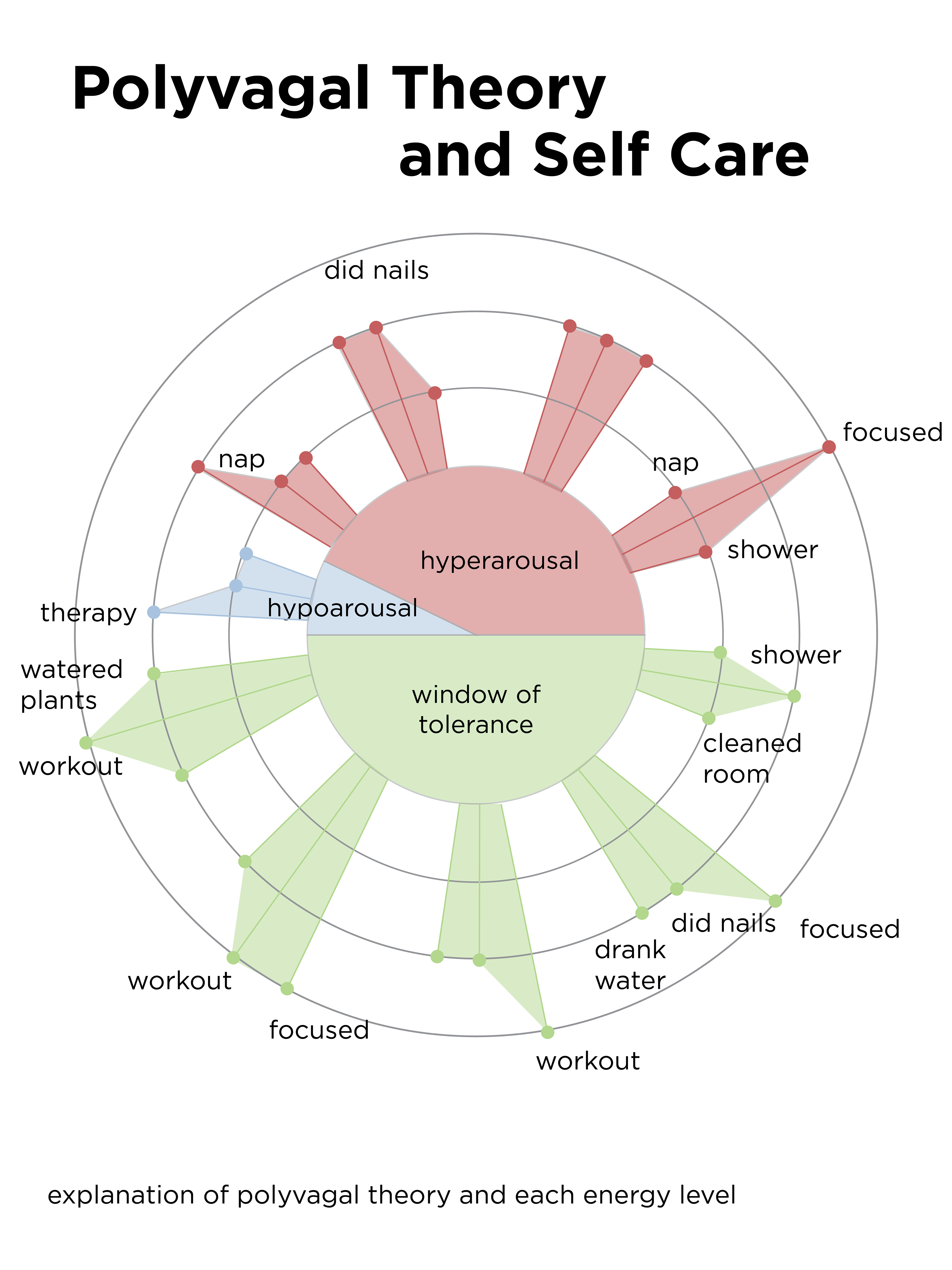
The final graphic.
For the final graphic, I wanted to make sure to clearly explain polyvagal theory in as little words possible. I decided the best way to do so was to create an "energy bar" demonstrating the different energy levels in regards to the colors in the graphic. With each label, I also included an example of an emotion or activity to better explain it.