evernote rebrand
fall 2024
For a branding class I was asked to create a brand or rebrand an existing one. I chose to rebrand Evernote and give it more of a classic look.
Evernote is your catch-all companion for your files, notes, lists, and dreams. Store everything in one place and let your mind run wild. They emphasize letting creativity and organization coexist in a space perfectly personalized for every user.
mark + signature
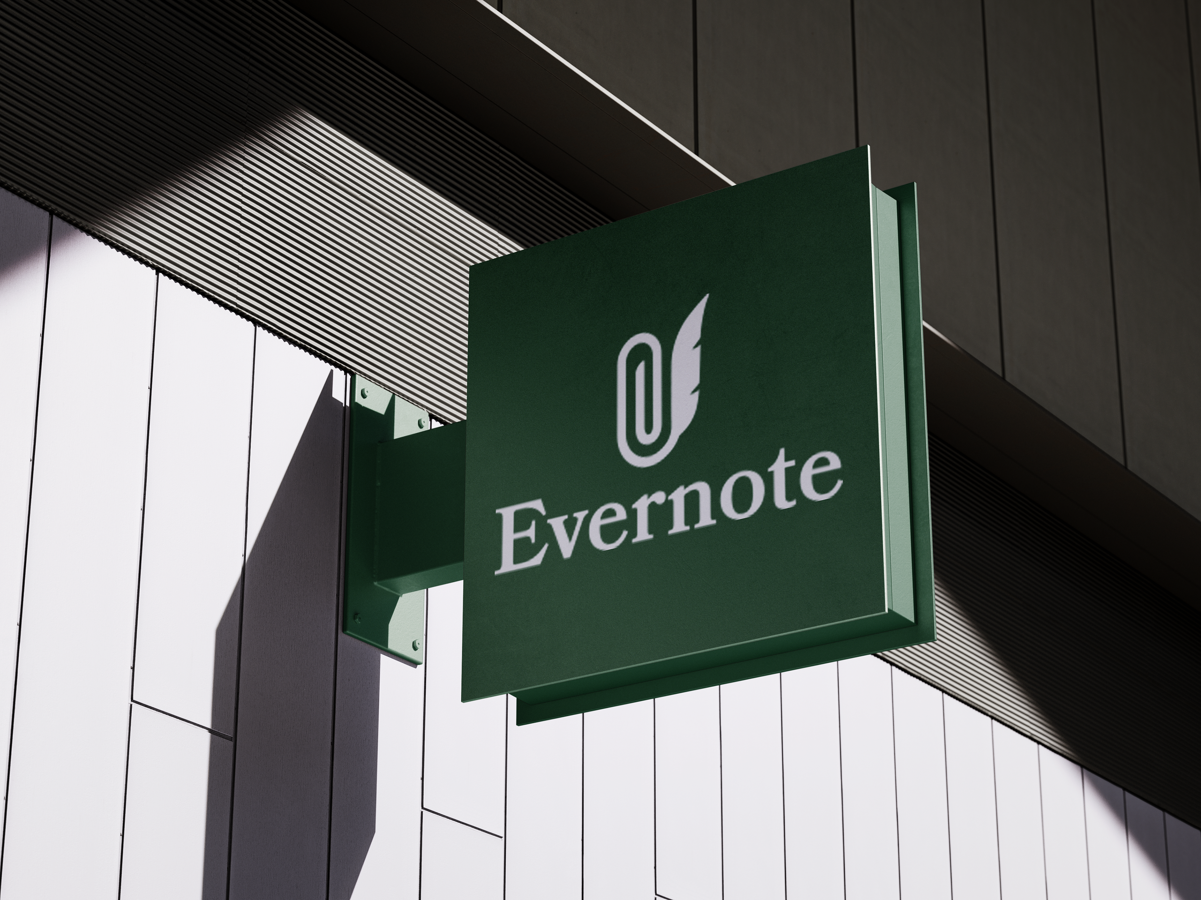
Early on I was really inspired to combine an organizational tool like a paperclip or pocket with a writing tool, specifically a quill. The quill has become a symbol of the strike of inspiration of the classic writer, implying a messiness that accompanies the creative process that other modern writing tools do not. It is messy, light, and innately creative. These were the three directions I refined from sketches, each with a varying degree of whimsy and organization.


Clean, rounded lines meet the bounciness and inspiration of an author's pen. The quill symbolizes ideation, creative freedom, and the strike of an idea. The paperclip represents order and organization, with a technological connotation to file storage. The mark seamlessly blends the two as Evernote does in its functionality.
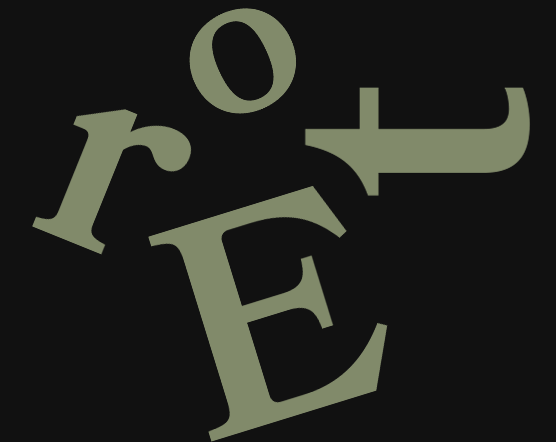
Typography came easily; I fell in love with the aptly named Bookmania due to its similarity in curves to my mark.
The terminal of the r strongly implies a drop of ink on a pen, the gentle slope of the E mirrors that of the quill, and the curve of the t contrasts well with the structure of the rest of the letterform in the same way the mark does with the paperclip and quill.
brand assets
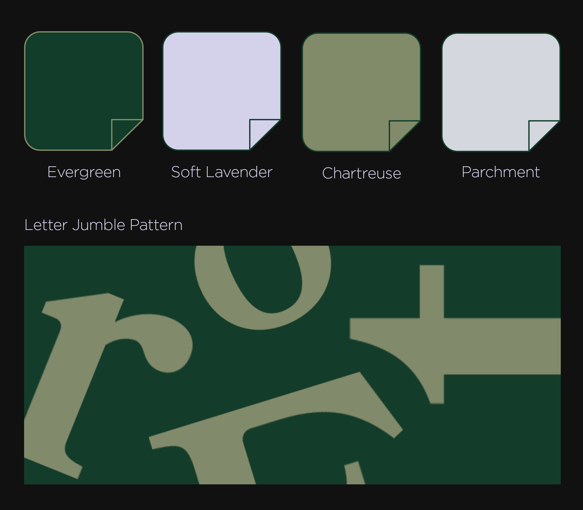
To go along with the mark, I put together a color palette of both rich and muted shades that work well with dark mode and light mode screens. I also utilized this letter jumble pattern often because I love the details of Bookmania.
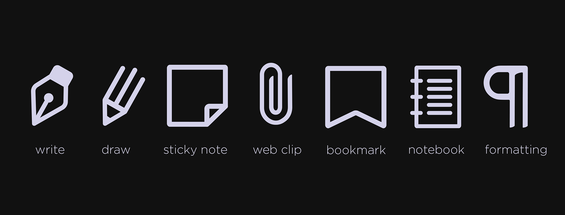
Next, I created a set of icons primarily for use in the Evernote app, though I was able to mimic their shapes in other applications.


digital design
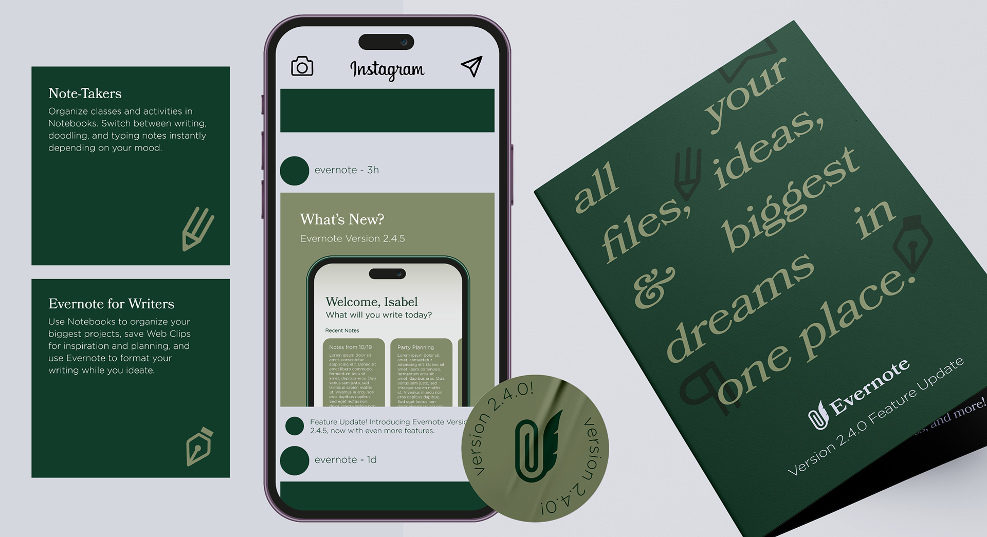
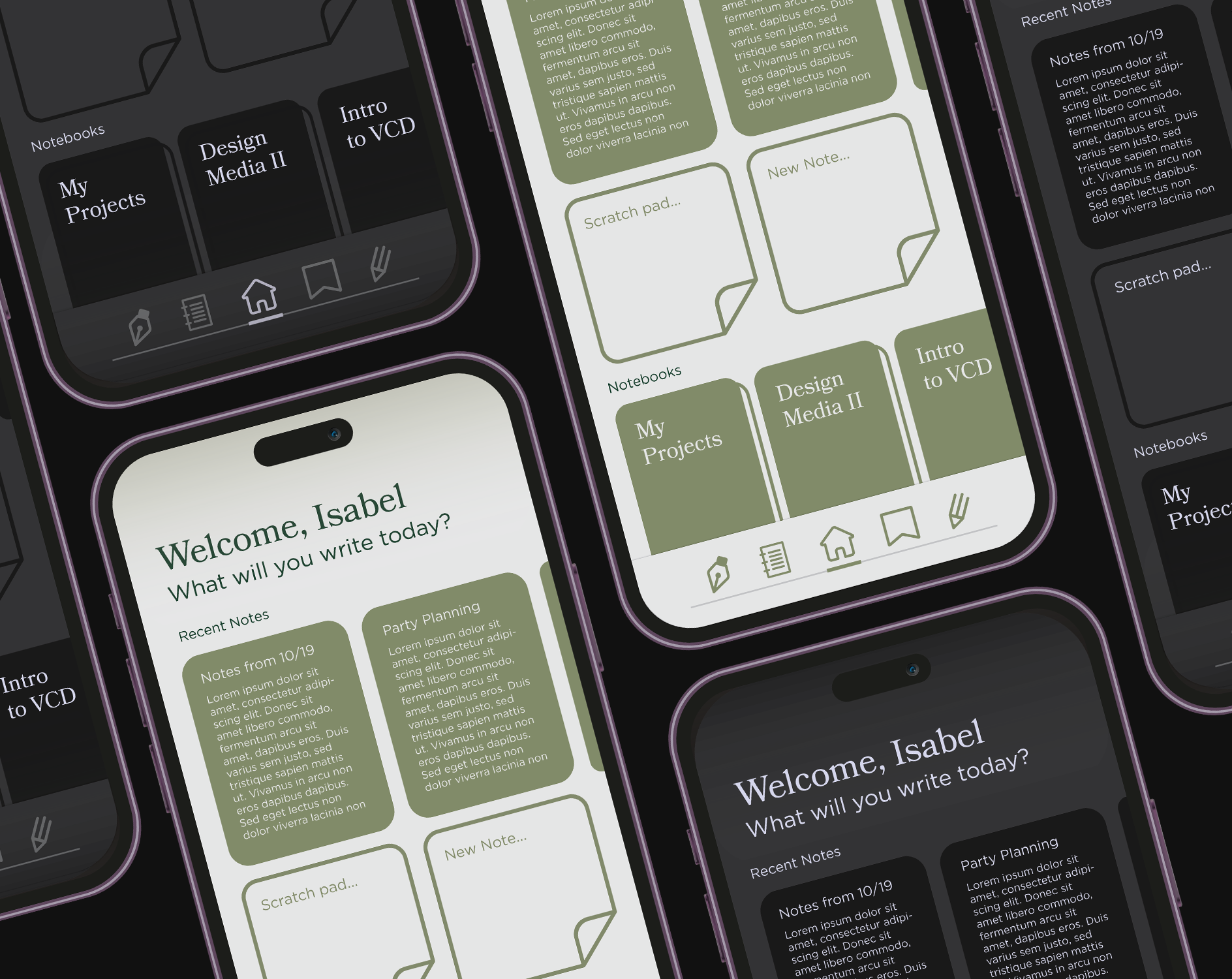
My favorite part of the project was creating new interfaces for Evernote using the brand I created. I wanted to keep Evernote's current focus on analog-inspired features, bringing more of a classic feel to it along the way.
For the homepage of the app, I included access to recently used notes, scratch pad and new note widgets, and recently used notebooks. I kept the recent notes and widgets at a natural thumb's reach to make them easiest to access. I used the icons I created in the toolbar to relieve some of the wordiness of the interface that naturally occurs with note-taking applications.
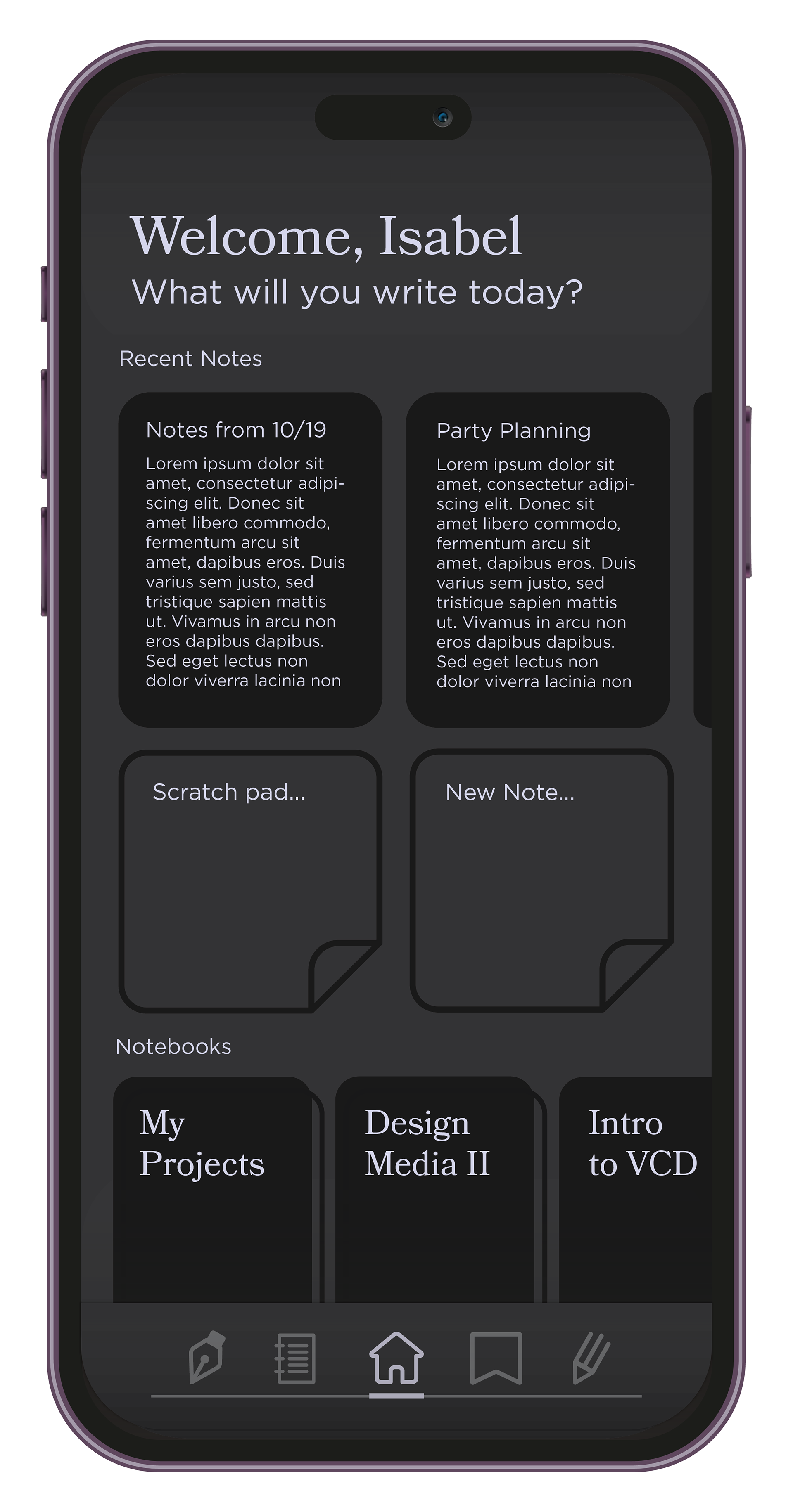
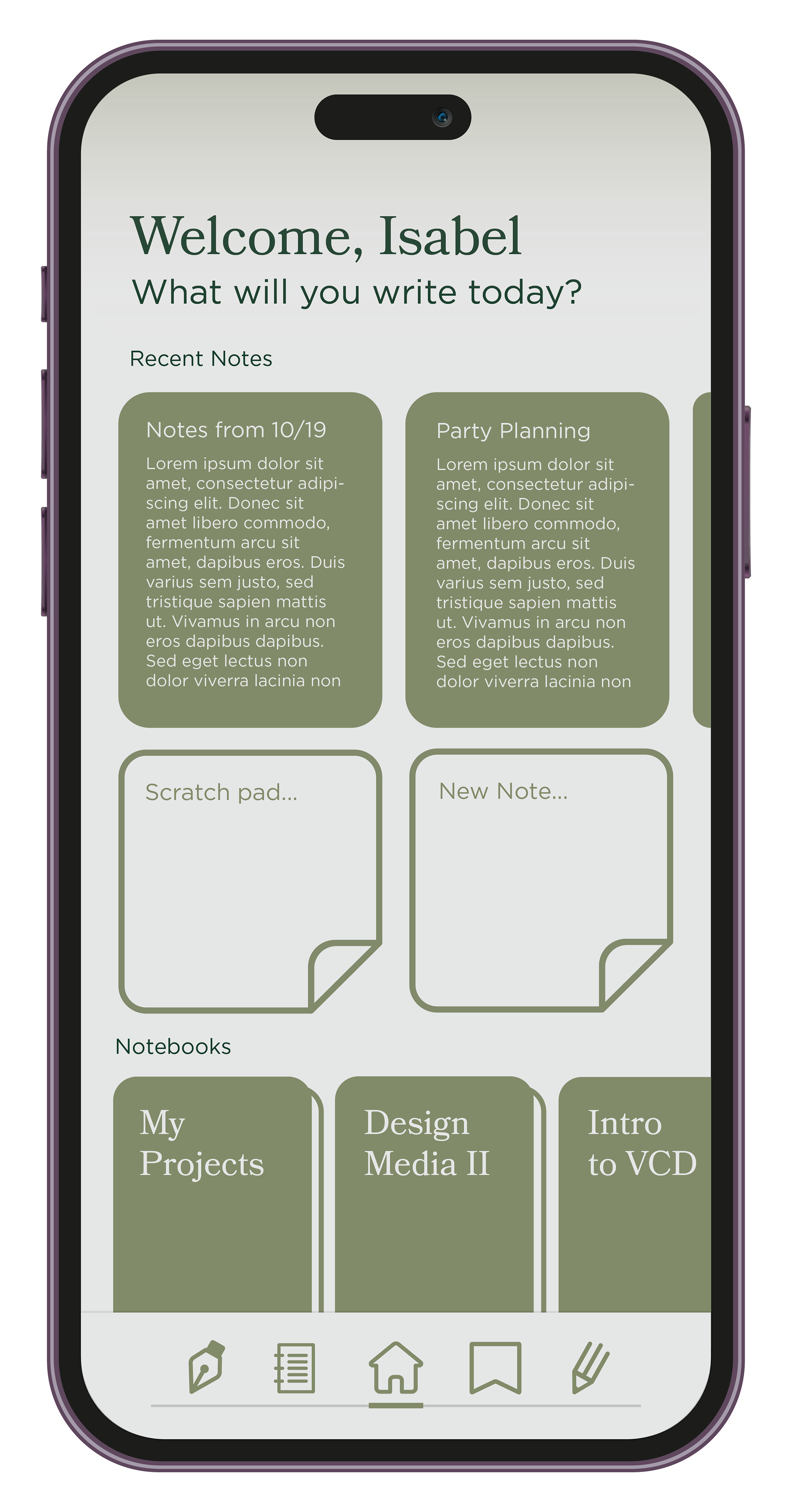
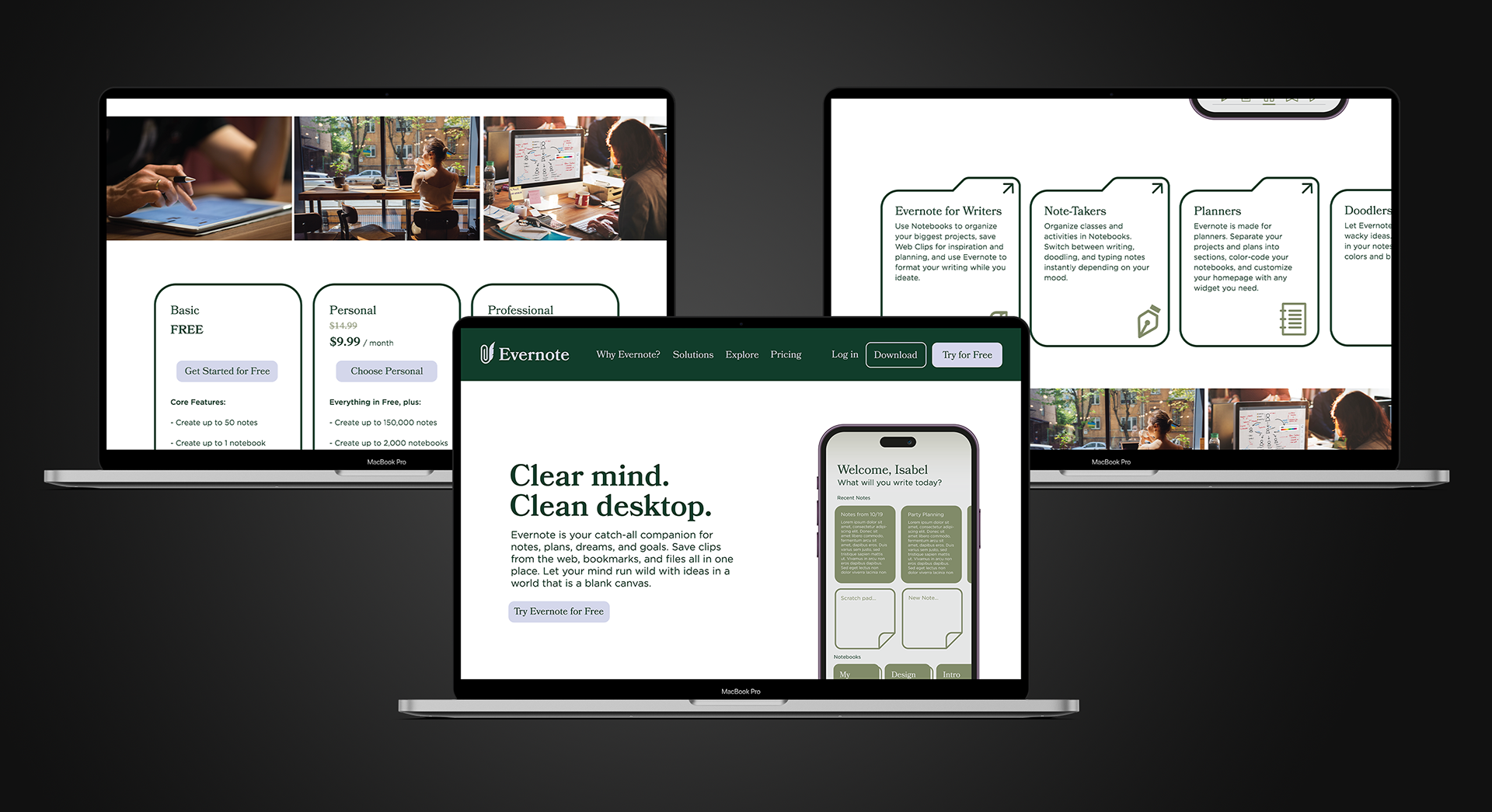
To reflect Evernote's emphasis on giving users peace, I kept the web design nice and simple with a friendly feel.
everbook concept
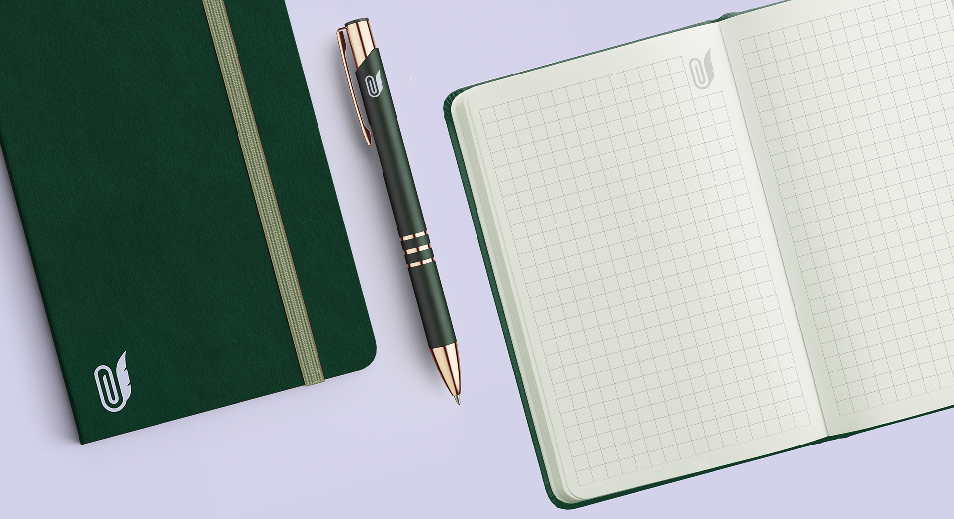
The EverBook is a concept I created for Evernote, a cutting-edge smart notebook designed to seamlessly blend the analog and digital worlds. Featuring high-quality pages optimized for both traditional writing and digitization, the EverBook syncs effortlessly with the Evernote app, ensuring your handwritten notes are always accessible on the go. With advanced handwriting recognition and organizational features, the EverBook is perfect for professionals, students, and creatives looking to streamline their productivity.
other applications
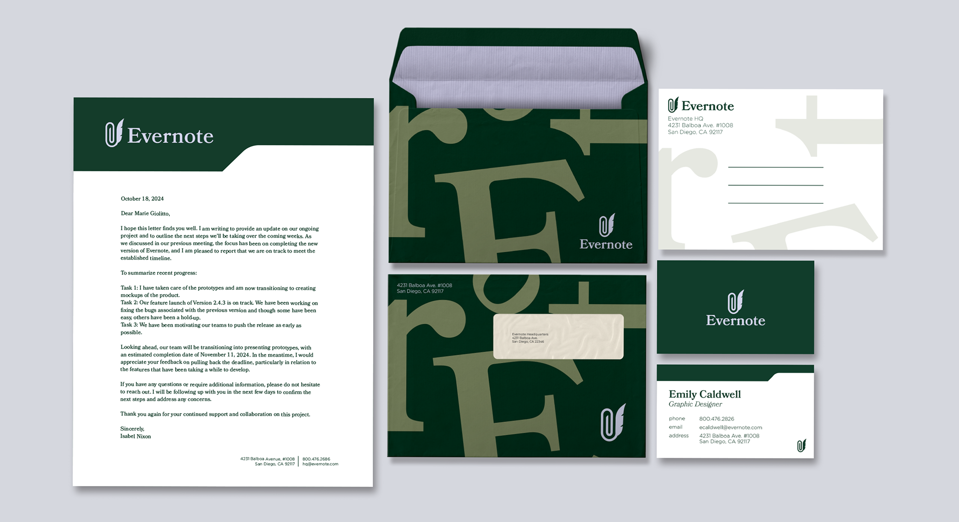
Motifs from traditional filing and office organization give the stationery a classic look.