mosaic magazine
spring 2024
A friend on the OSU Mosaic Magazine team asked me to do a rebrand for the magazine. She wanted something classic yet whimsical and flexible. I spent a lot of time ideating, testing different concepts and typefaces. I finally came to a final logo, using elements from their original logo but giving them more character and life.

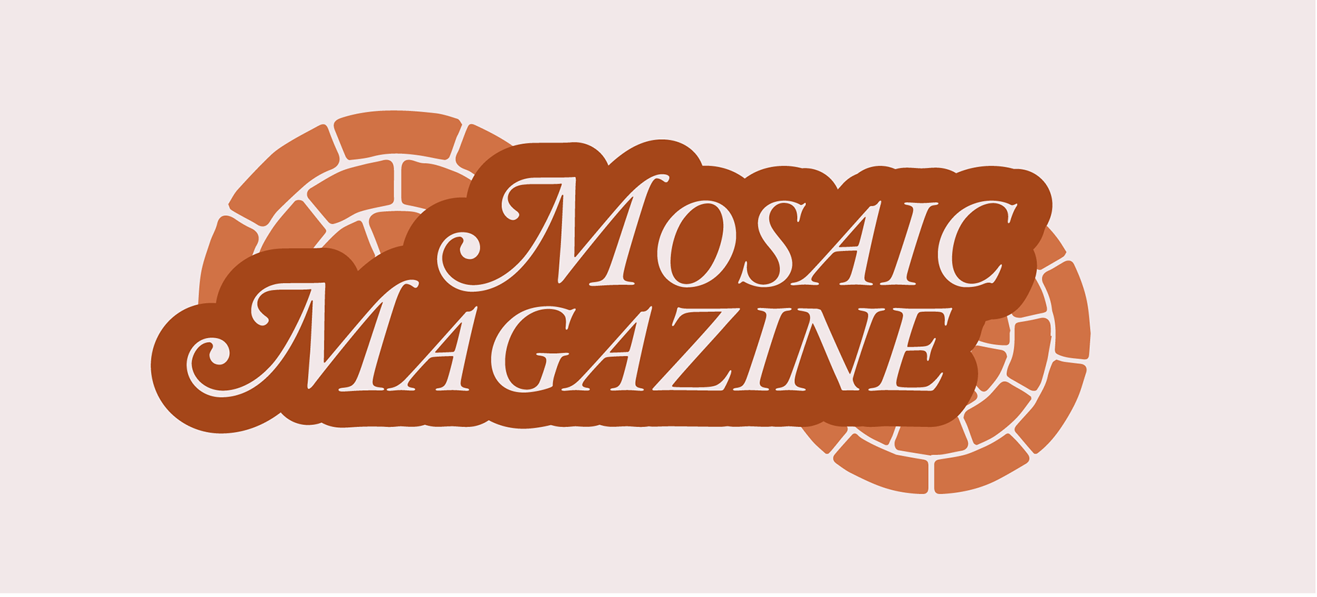
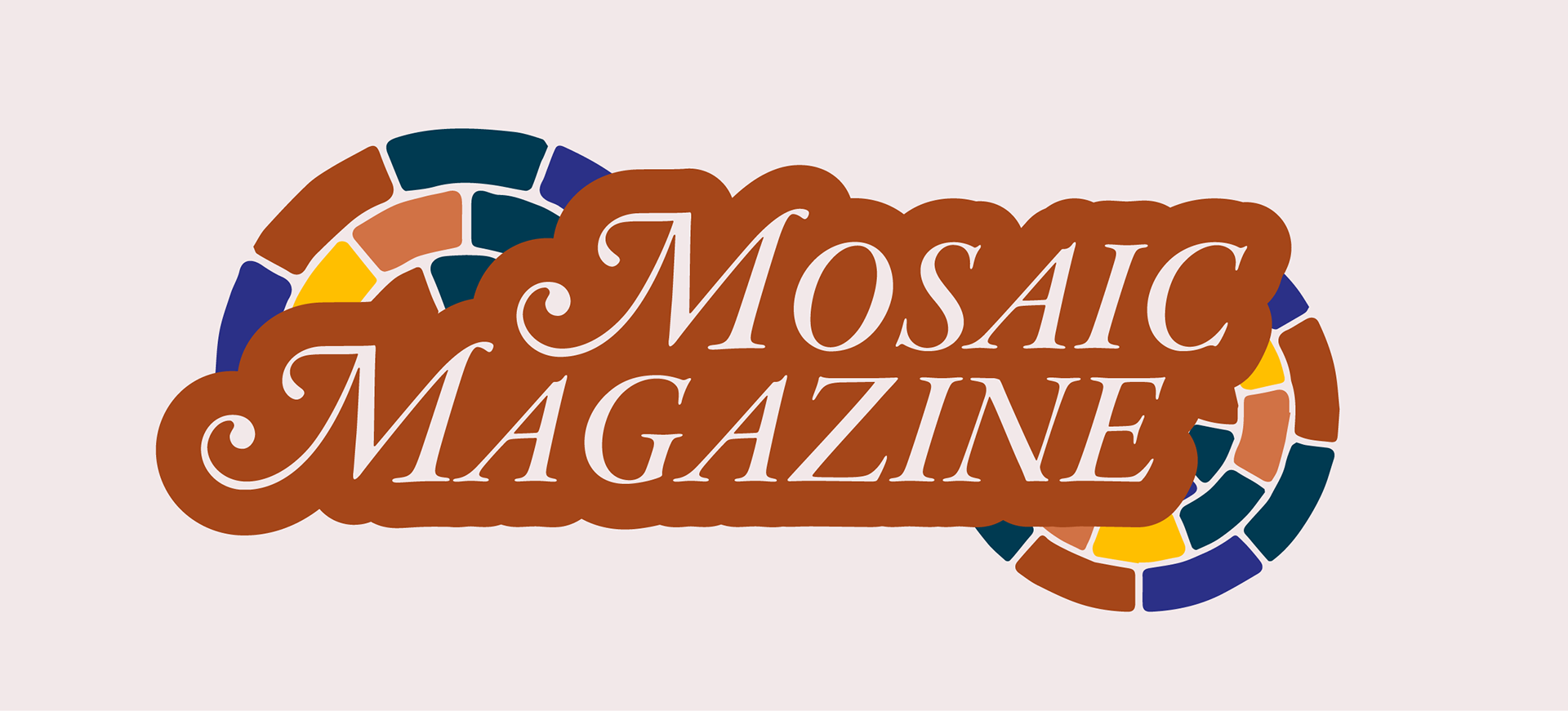
The final logotype in full color.

When starting projects having to do with branding, I typically begin with creating a color palette. This helps me better visualize what the brand could be and what personality it might have. I created these two palettes, inspired by mosaic tiles on sidewalks. I chose the second one in the end, though I do still love the jewel-like teal from the first.

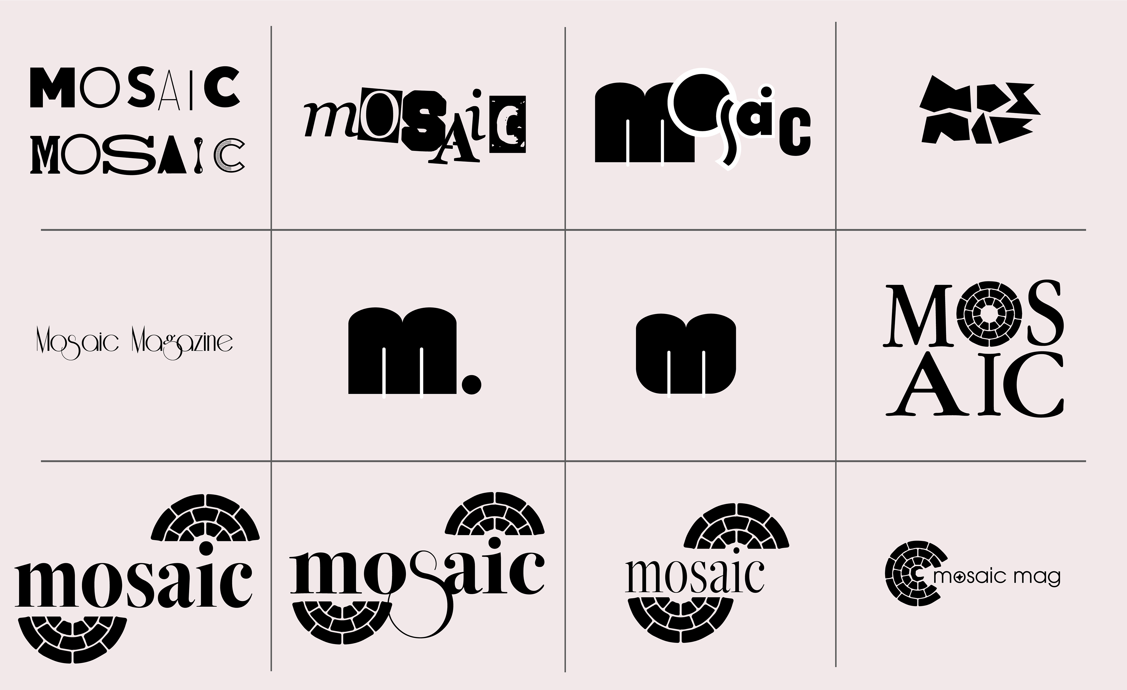
My initial concept was what anyone's might have been--a medley of letters of different fonts that come together to spell "Mosaic". These were ultimately too modern for my taste so I focused more on integrating typography and a graphic. Using the magazine's current logo, I tried to incorporate it into a tall serif font (I tested using Apple Garamond), but I felt these were reminding me too much of 90s editorials and weren't exactly classic enough.

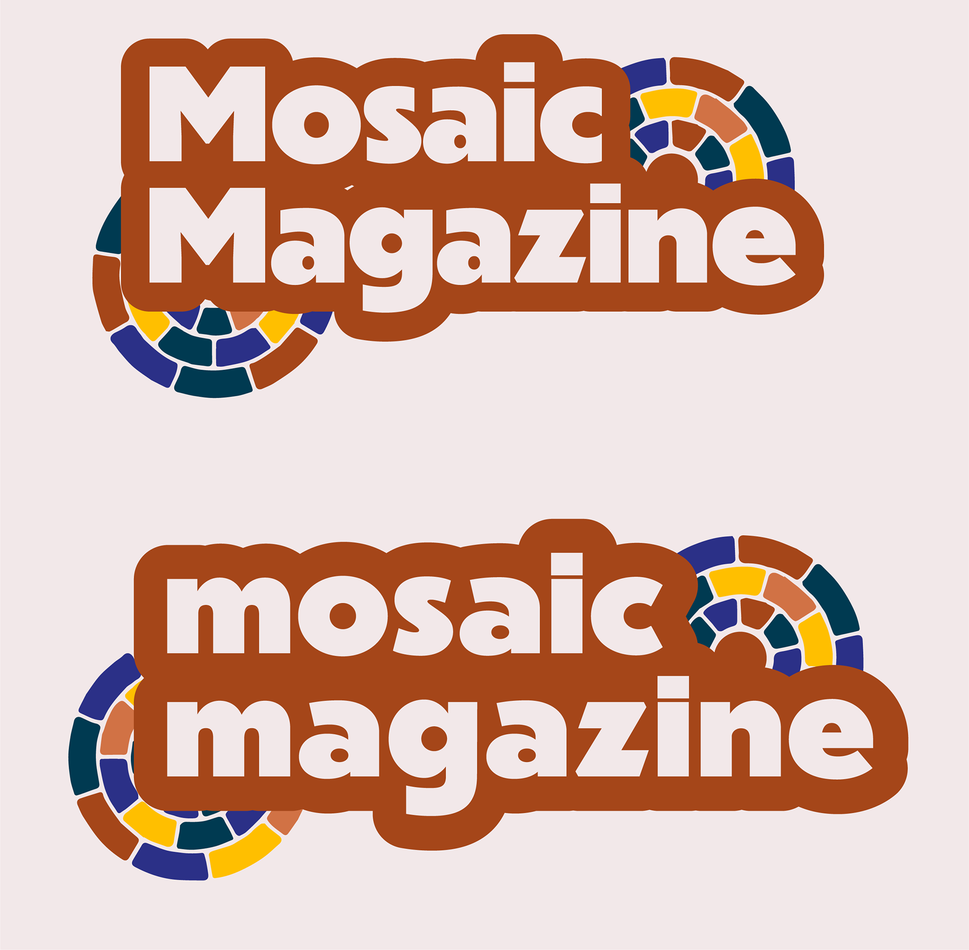
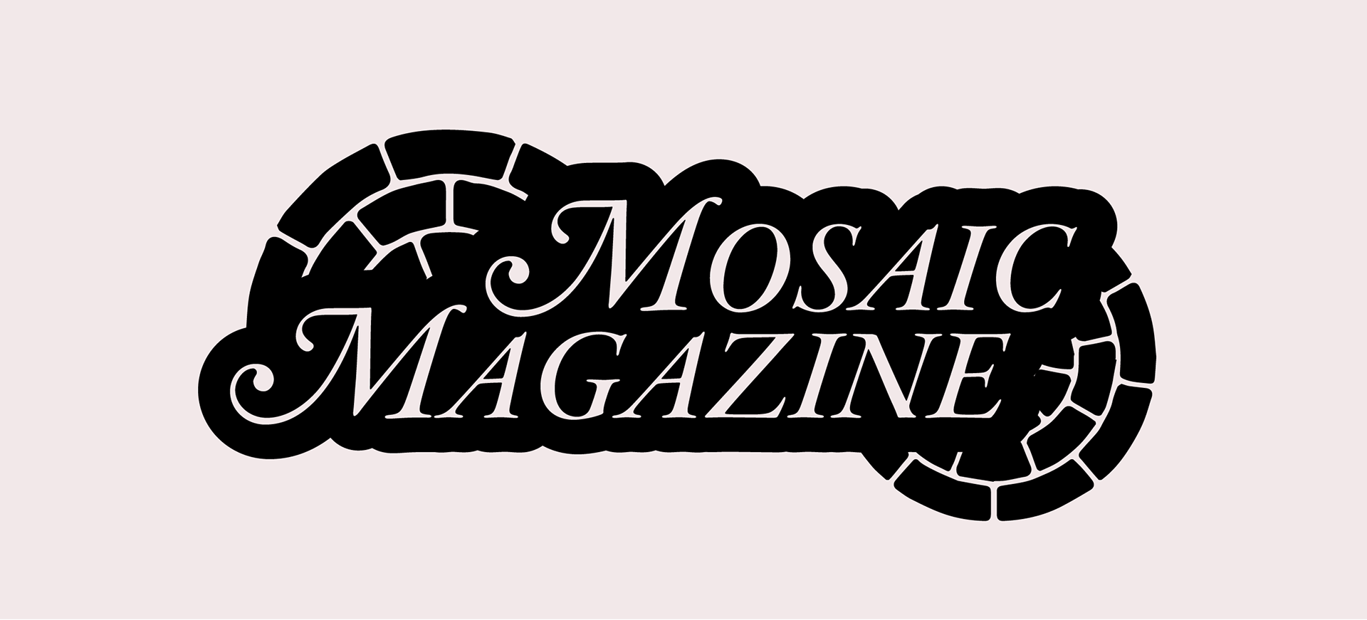
More concepts for the logotype.

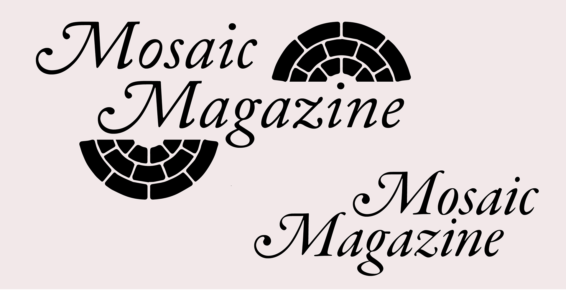
One of the typefaces we learned about in typography last semester was Garamond. I tend to appreciate fonts like this because they have built-in glyphs with swashes and other decorative flair. They are also just very classic and timeless, and though they are very old, they have a warm and comfortable quality to them that felt right for this magazine. I tested using Caslon and Garamond, incorporating the mark around the text.

The swashes on the M's were drawing too much attention to themselves so I balanced the rest of the letters out by using smallcaps. After this, everything FELL into place. I wanted to make the logotype feel like a sidewalk of tiles that flow together with a nice pattern, so I bordered the letters and inserted the mosaic marks beneath.
Finally, I created a brand guide page for my friend to use so she could have an idea of how all these elements could be used. Overall, I am very happy with how this turned out. I initially got frustrated in the ideation process, but I really wanted to make something I could be happy with, and I'm glad I stuck with it. I loved helping out a friend and using this project to test how quickly I could complete a brand identity (which, as it happens, is about three days). 

You may also like

Back to Top