songbird music player
autumn 2023
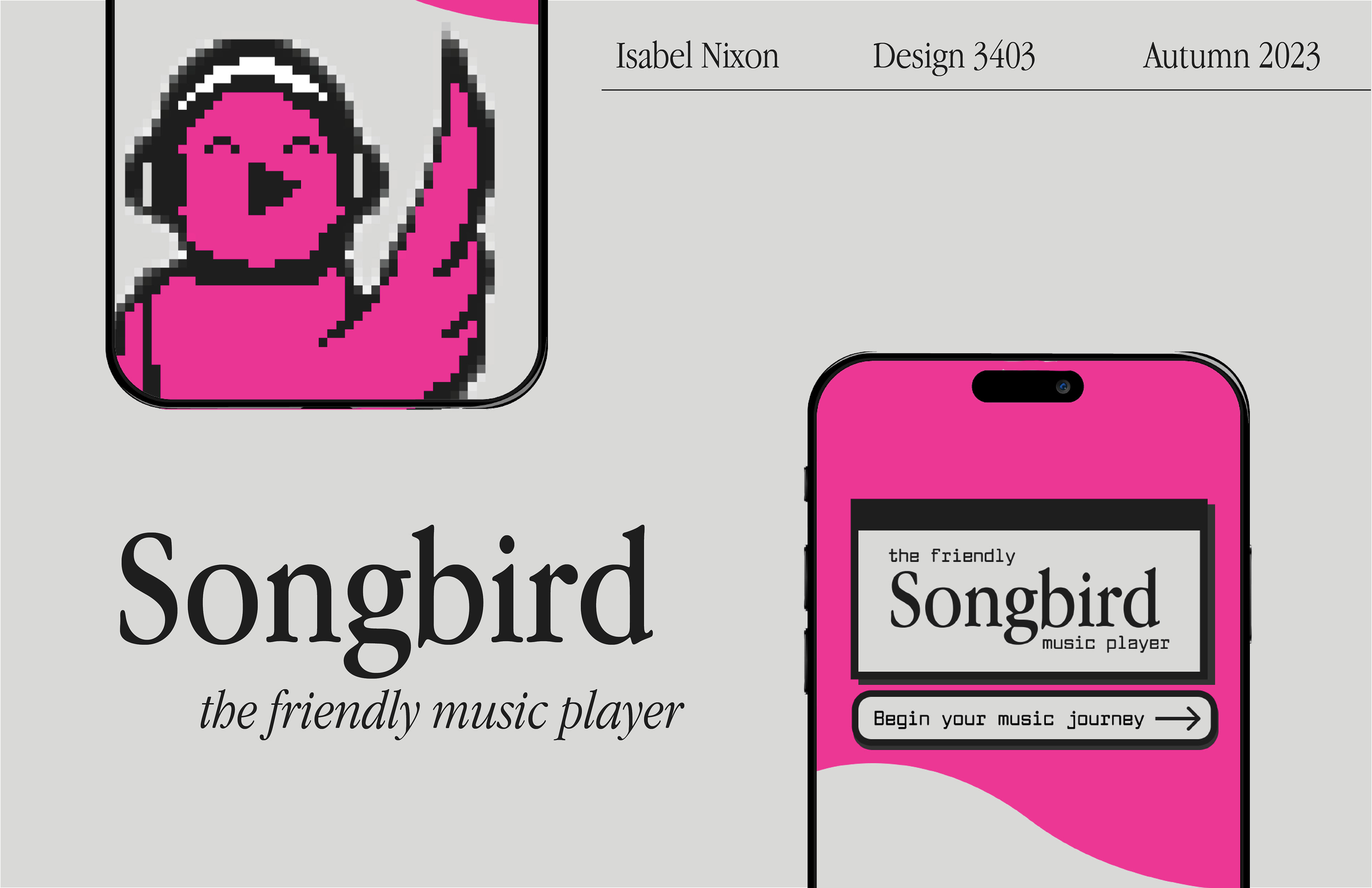
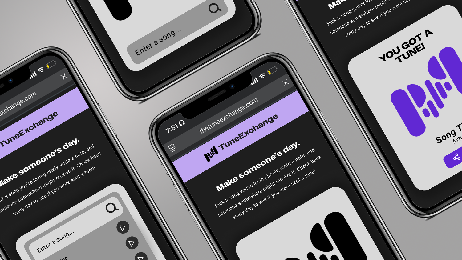
For my Design Media class, I created a music player app called Songbird inspired by 90s and 2000s aesthetics mixed with the technological functions we have today. Songbird is a return to the lighthearted friendliness of the Internet before social media, focusing on low-pressure socialization and the importance of the user experience. Below is the pitch deck for the app as well as an interactive prototype made on Figma and a few walkthrough videos (near the bottom of the page).
problem:
The internet has gotten hostile.
solution:
A media player all about friendship.
the concept:
Songbird was created with the intention of recreating a time when the Internet was friendly. Drawing inspiration from the 90s and early 2000s, before social media rose to its current prominence, Songbird is your built-in musical best friend.
values:
Curiosity. Friendliness. Customization. Creativity.
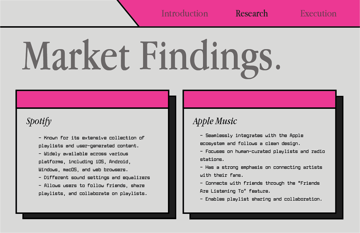
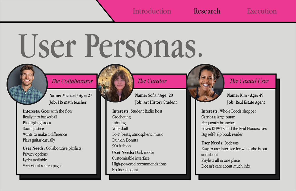
Based on the current market for media players (specifically those in music), I concluded that a media player focusing on friendliness and user support was needed. I created a few user personas and tracked their journeys using a typical media player app in order to determine pain points and ways to improve these issues.


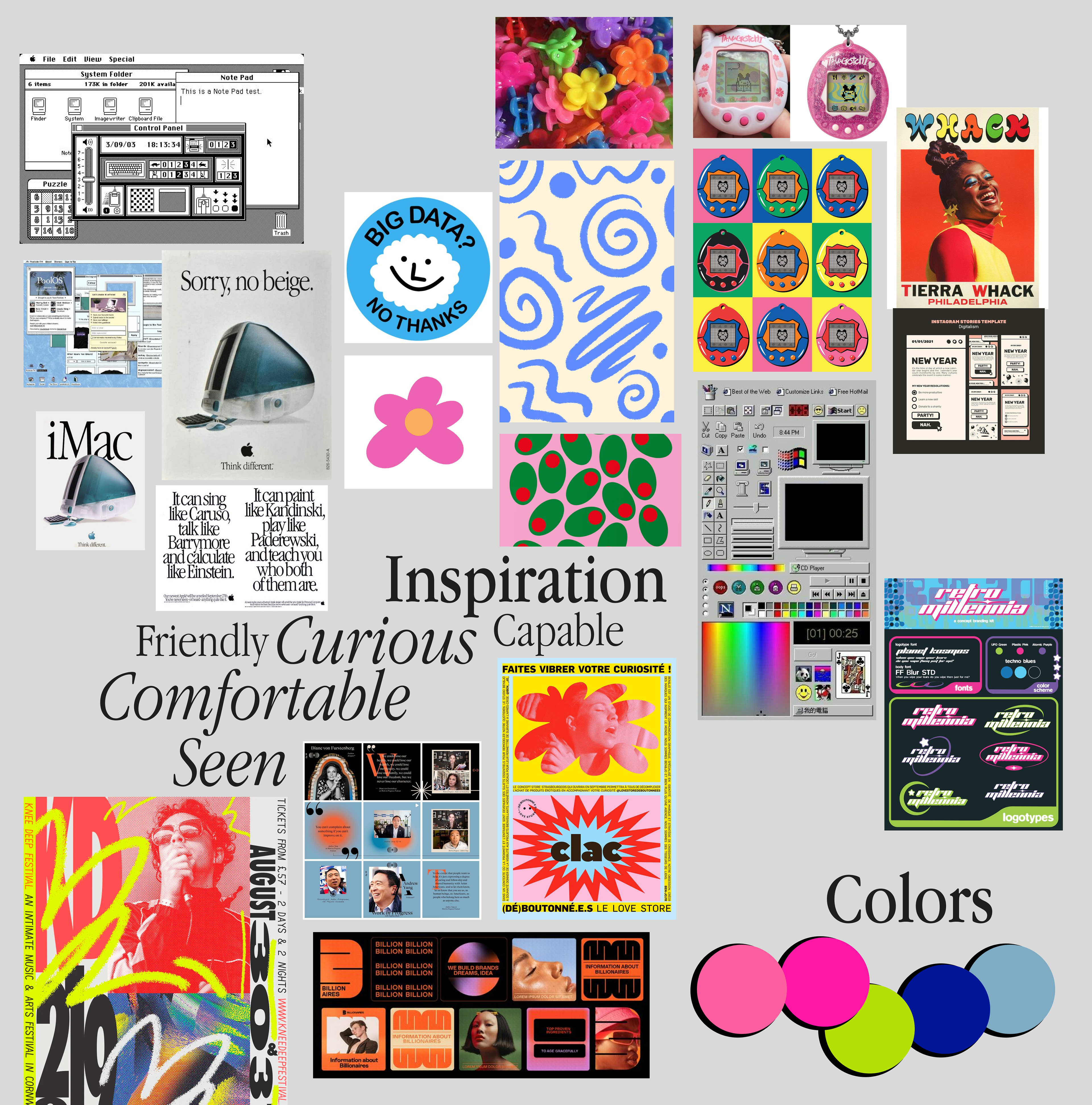
This is my original concept mood board for Songbird, detailing its values, color palette, and UI inspired by the original Mac.
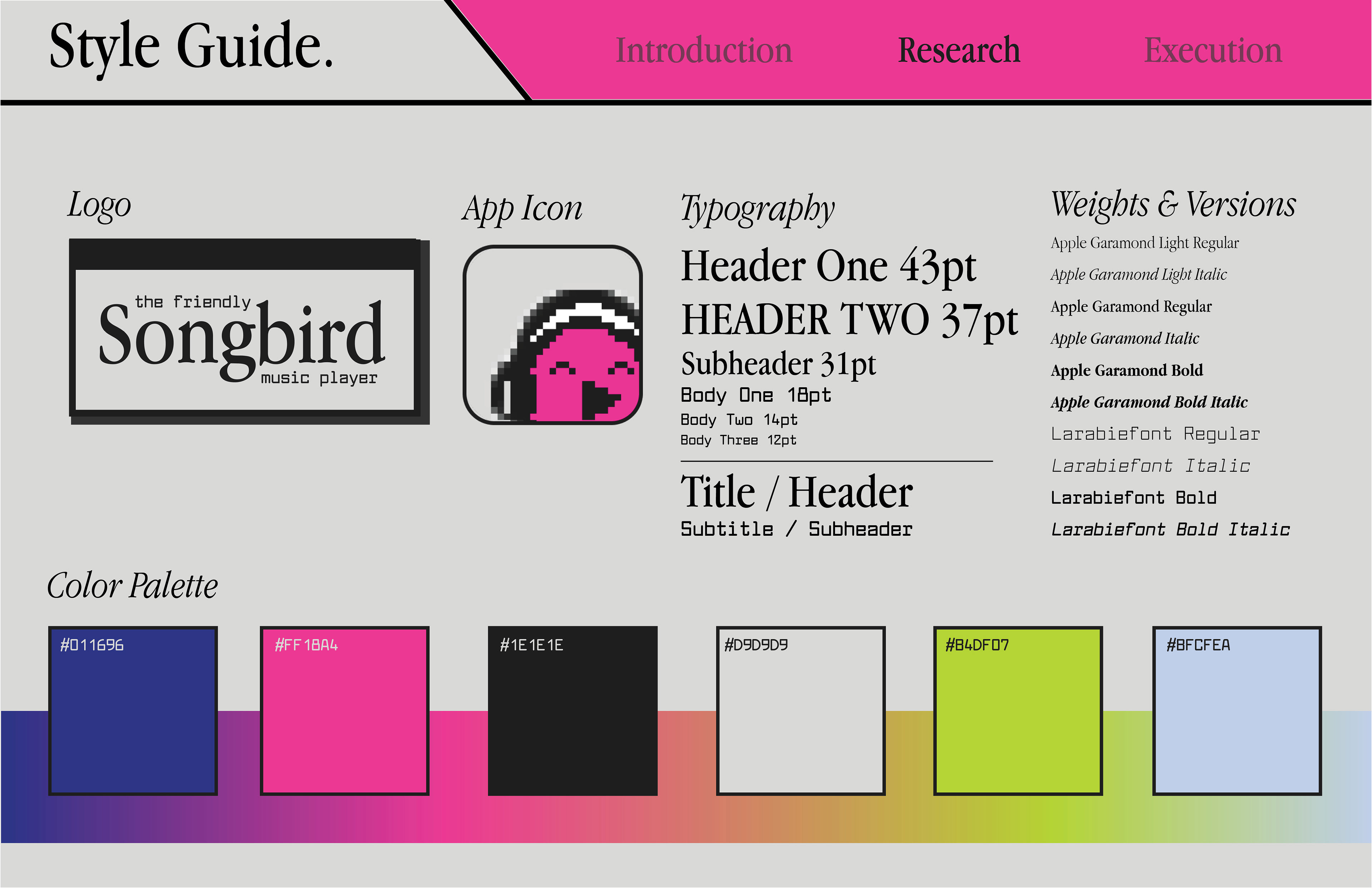
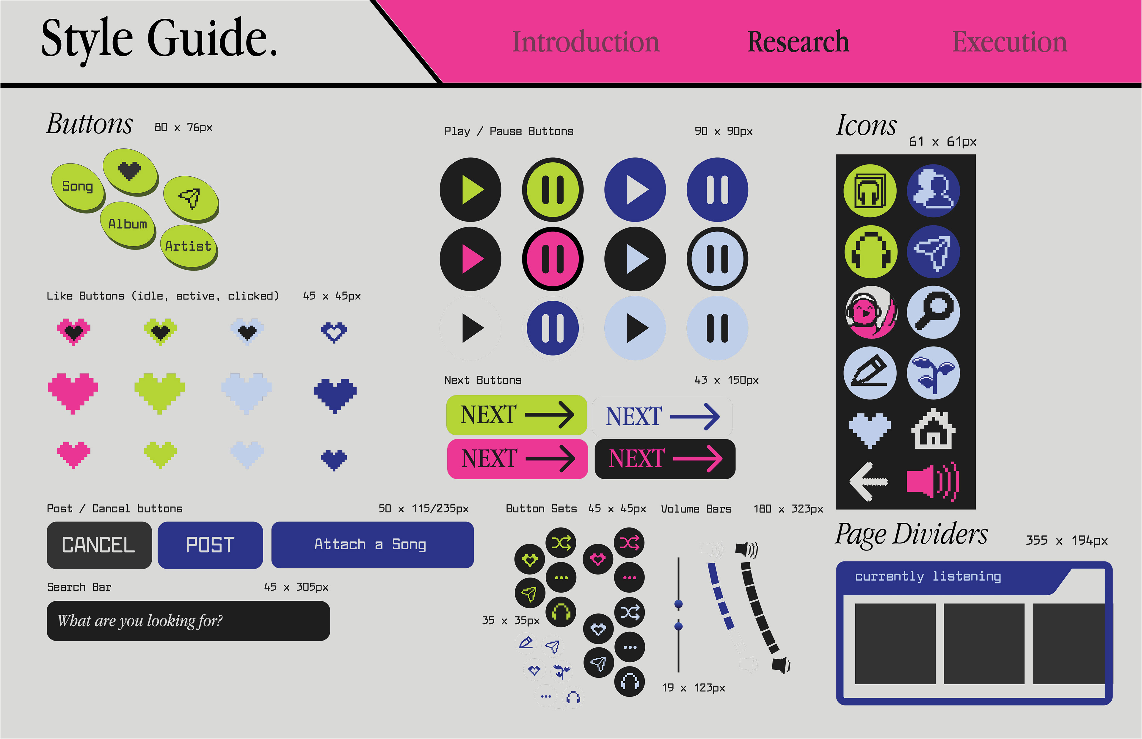
From the moodboard, I created a comprehensive style guide including color palette, typography, logo, app icon, and all the buttons used in the app itself.
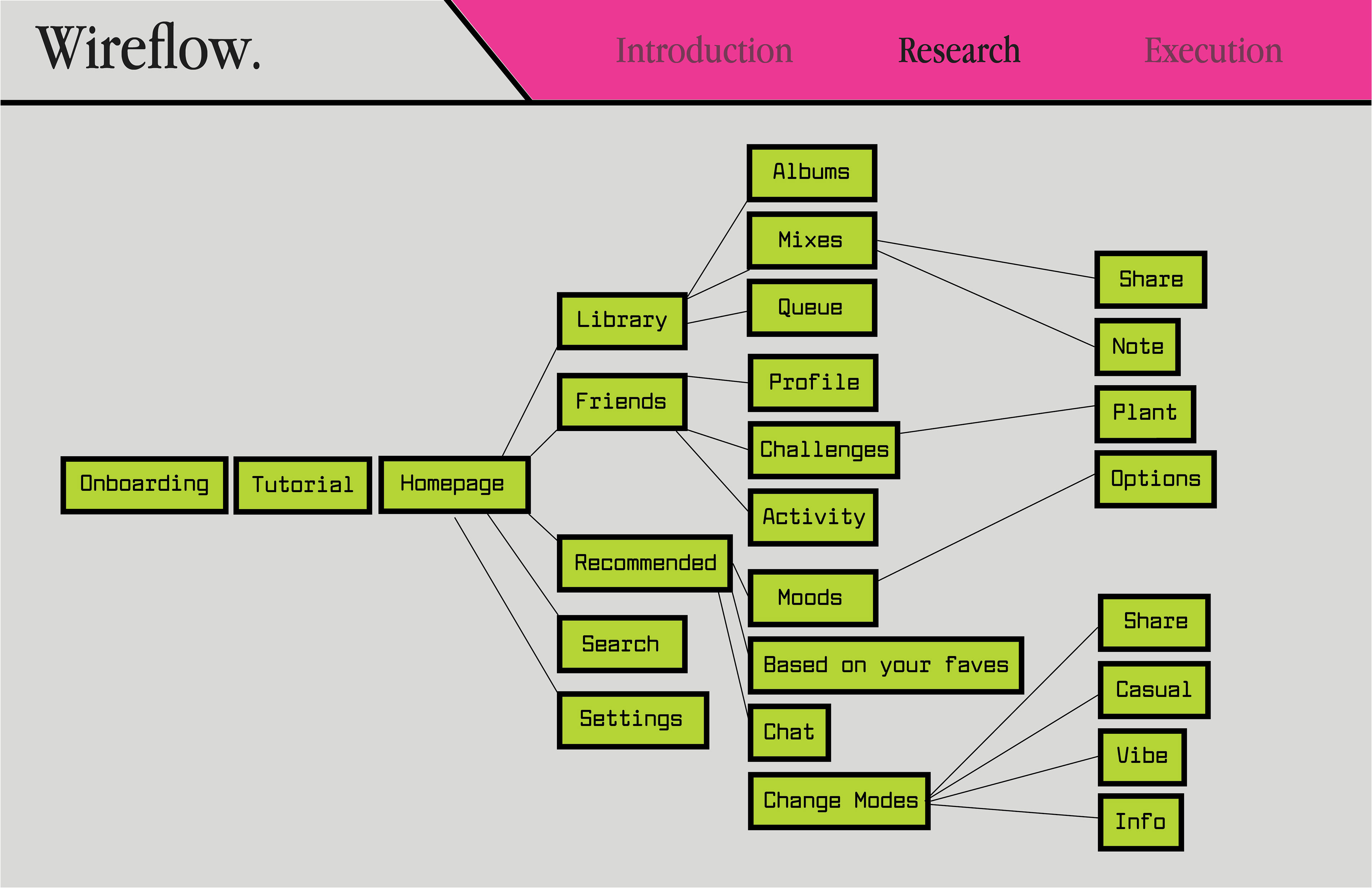
A wireflow for what features connect to which pages.

Lo-fidelity wireframe before styling, emphasizing connections between screens and organized by feature.
user testing:
Using heatmaps to track where users initial clicks are when given a prompt, I was able to confirm that my main icons on the homepage were clear and easy to navigate, as well as the organization of the app being clear.
I tested Songbird on my classmate by giving her tasks to complete that required a bit more knowledge of the app’s functions. One suggestiong that helped its navigation greatly was adding a home button at the top of each page rather than the settings button, which I kept only on the homepage if absolutely necessary. Another suggestion was adding more visual onboarding, which I did by demonstrating the different sections of the home screen.
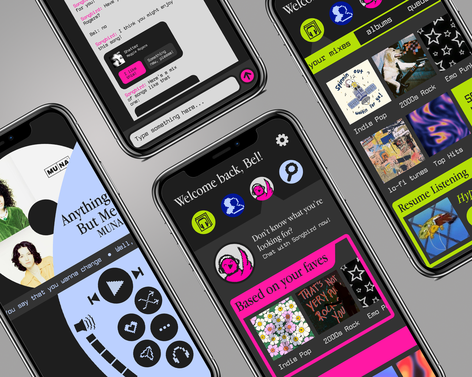
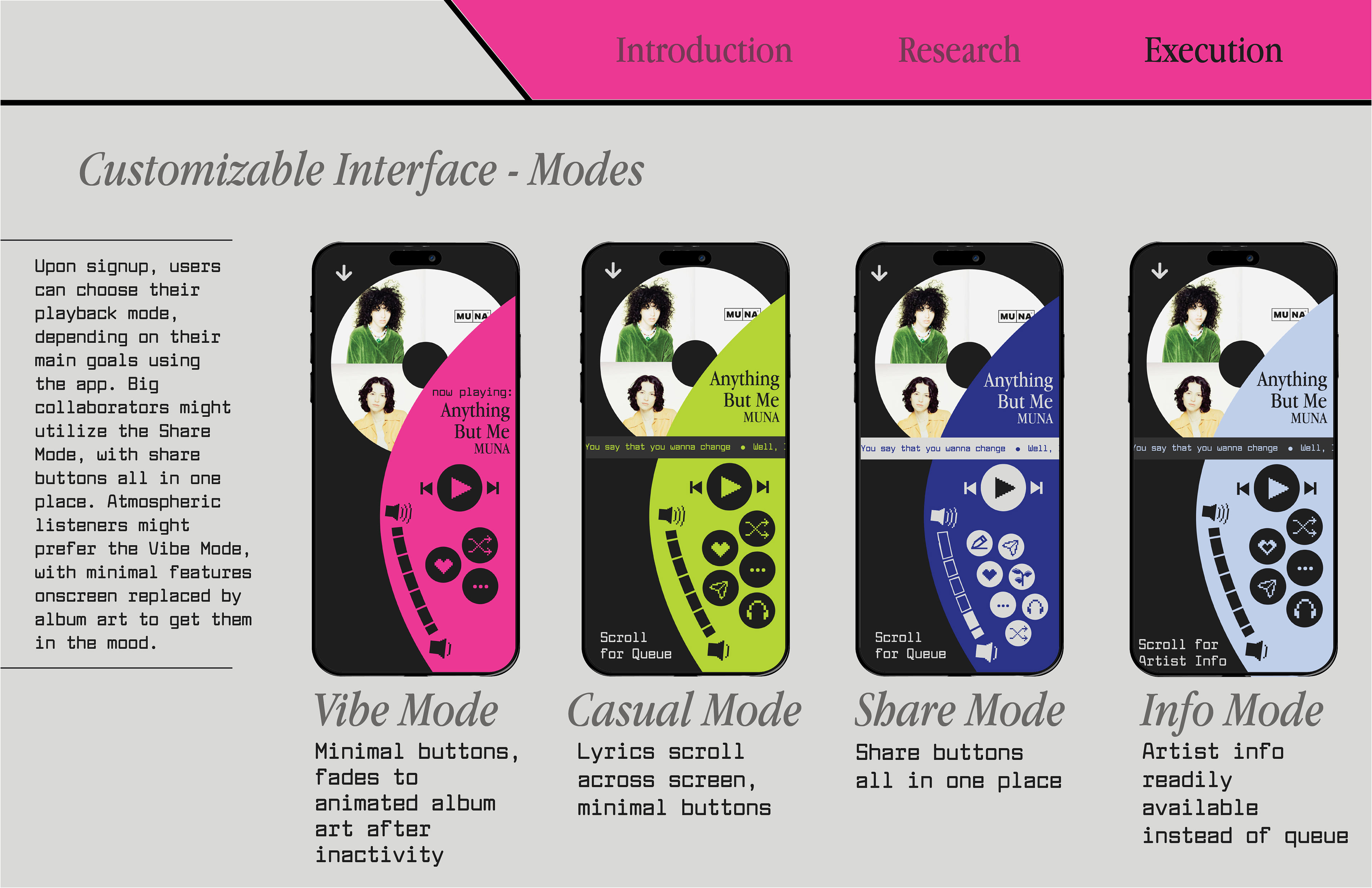
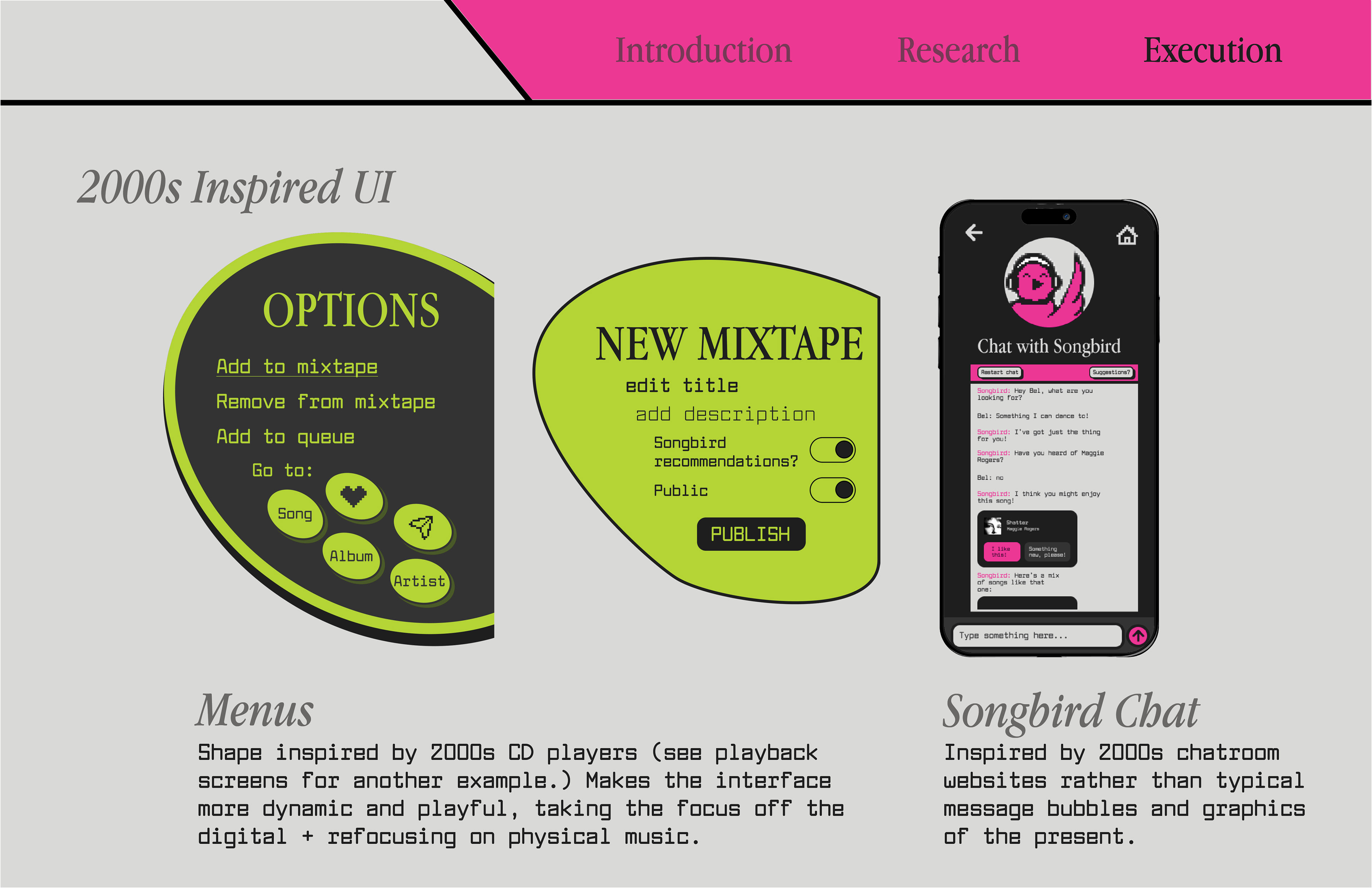
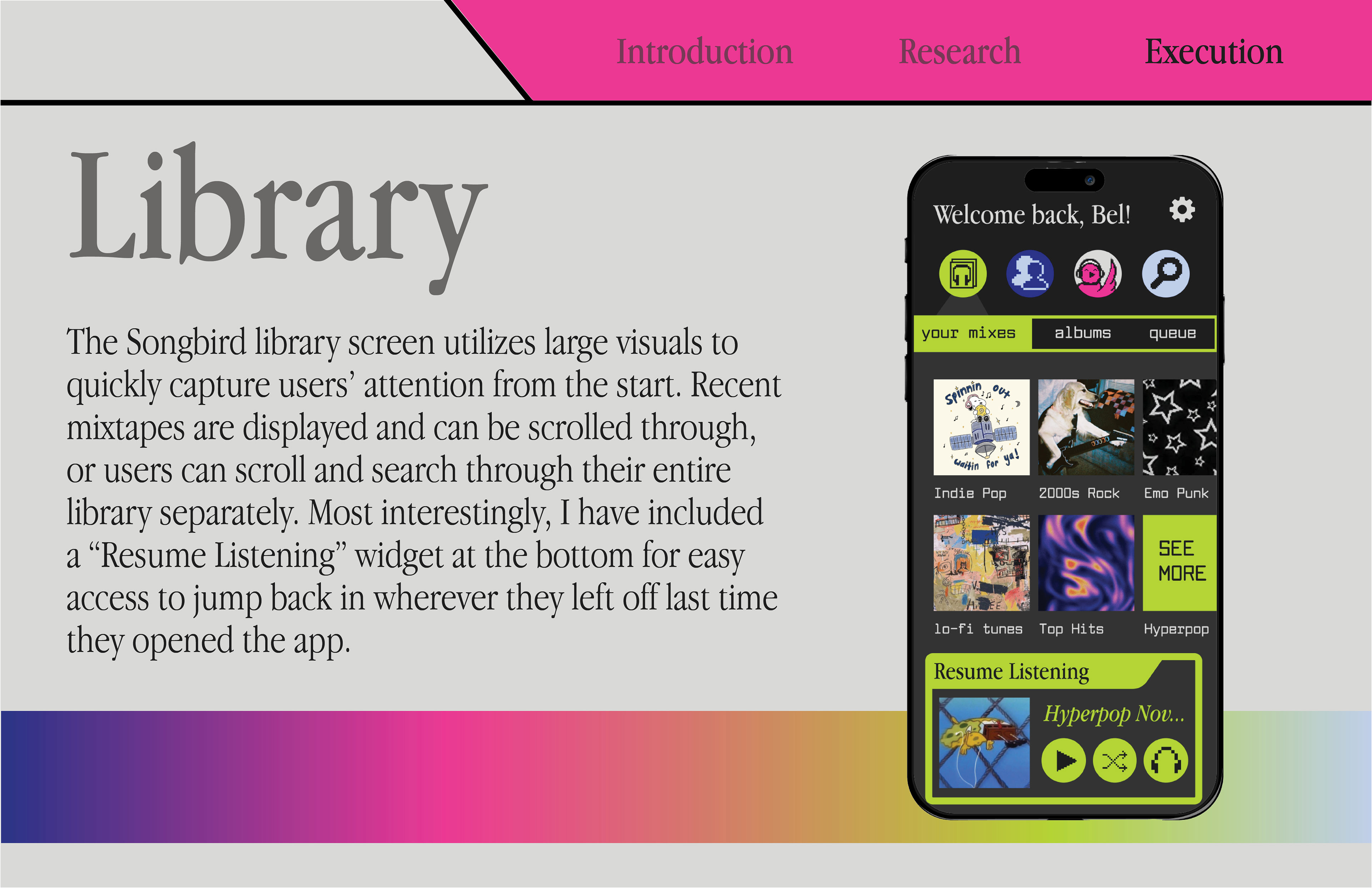
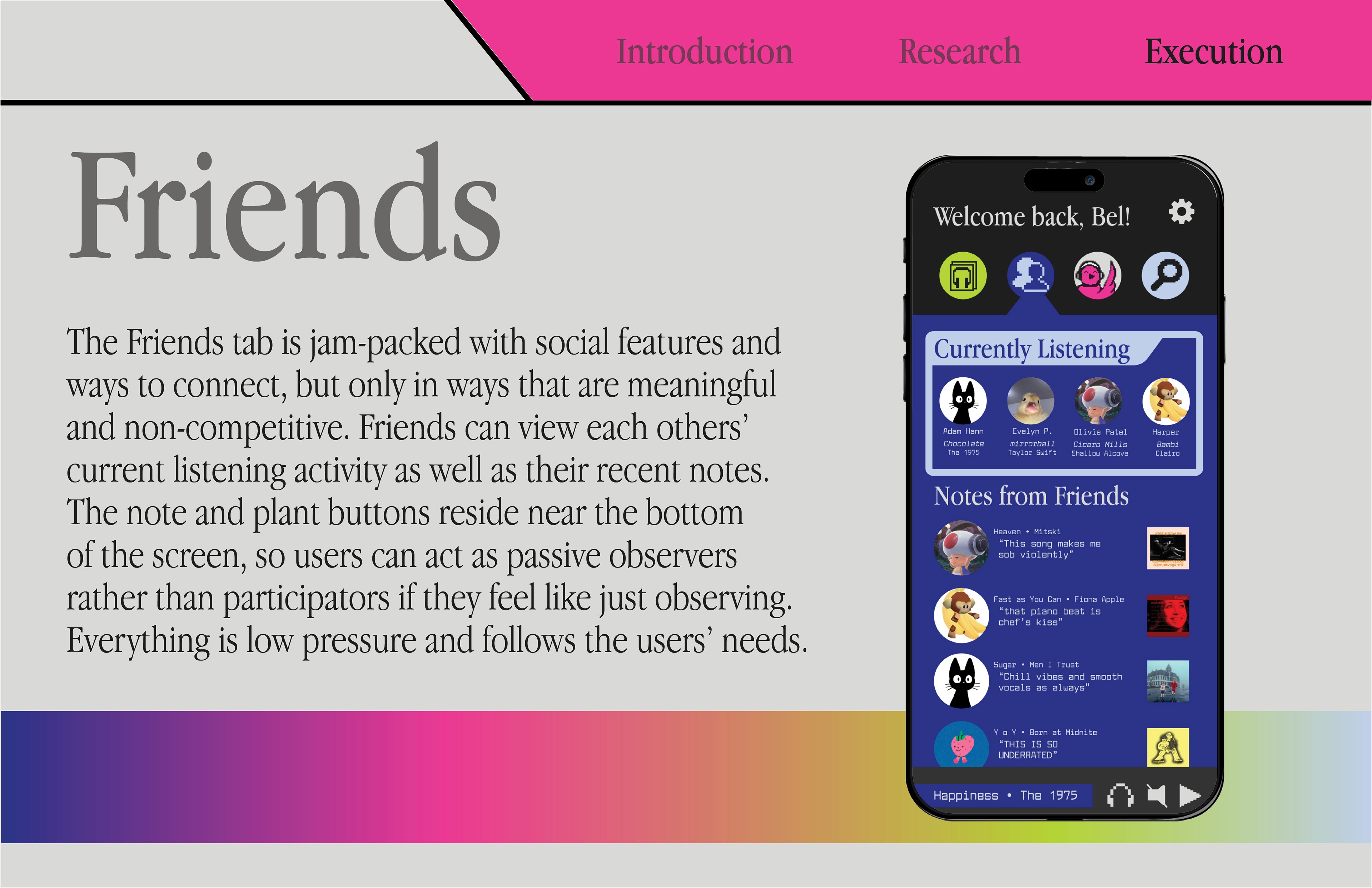
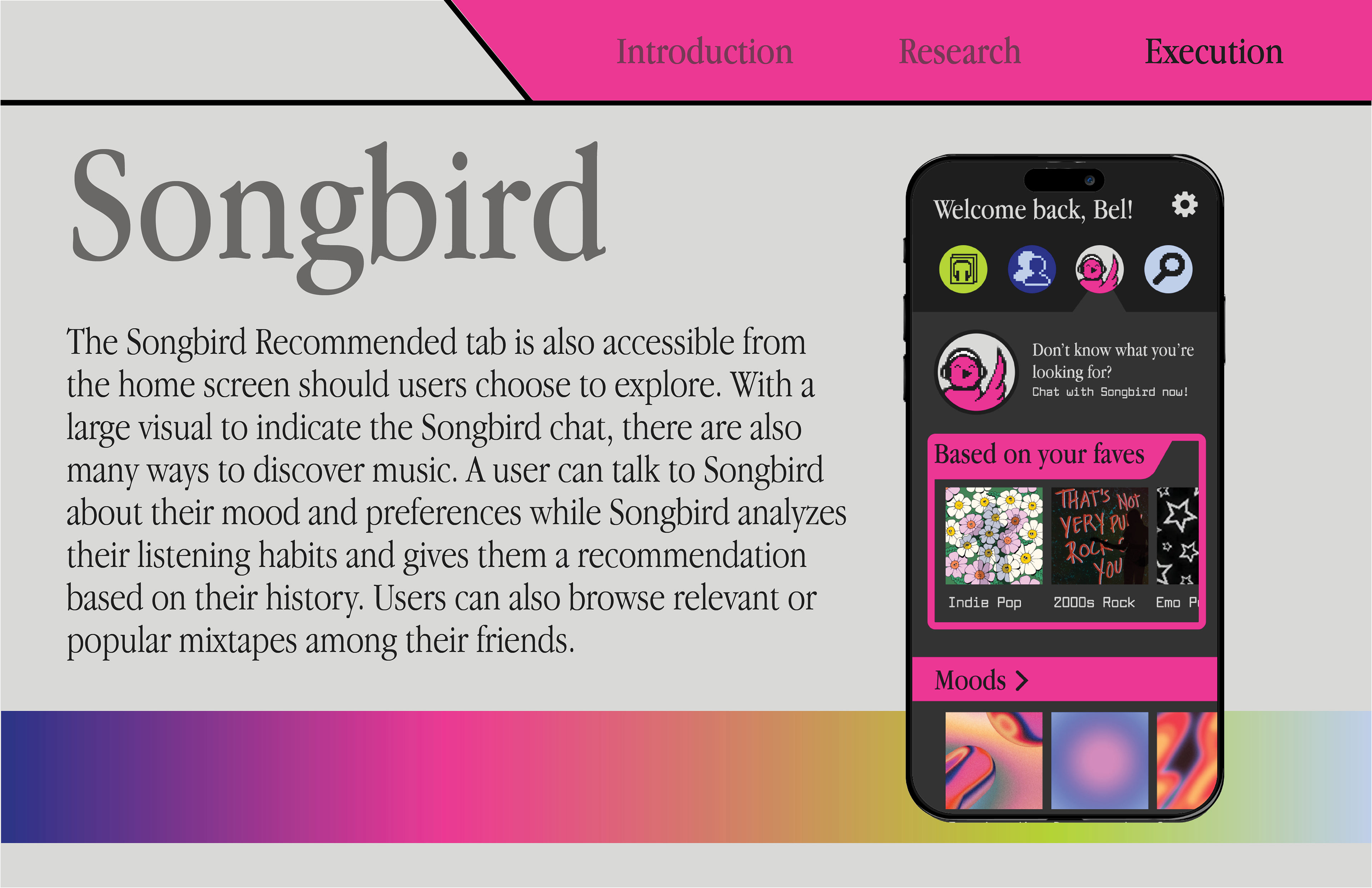
selected features:


prototypes + walkthrough videos:

Scan this QR code or click through the prototype below to experience the Songbird app! View in full screen for best experience.